Cavaliers Owner Dan Gilbert Addresses Cleveland in Comic Sans: Why We Facepalm
In case you haven’t heard, the only news in the world today is that LeBron James decided that he is going to play basketball for the Miami Heat instead of the New York Knicks or the Cleveland Cavaliers. This has made some people in Cleveland very sad, including the team’s owner, Dan Gilbert.
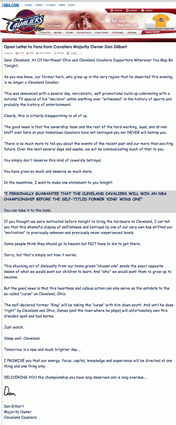
Dan Gilbert was so upset, in fact, that he wrote a very angry open letter to Cleveland fans, laden with surprising capitalizations and lines like “The self-declared former “King” will be taking the “curse” with him down south. And until he does “right” by Cleveland and Ohio, James (and the town where he plays) will unfortunately own this dreaded spell and bad karma,” and “‘I PERSONALLY GUARANTEE THAT THE CLEVELAND CAVALIERS WILL WIN AN NBA CHAMPIONSHIP BEFORE THE SELF-TITLED FORMER ‘KING’ WINS ONE’ You can take it to the bank.”
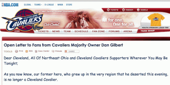
We will leave it to our sporting brethren at SportsGrid to parse the meaning and sporty implications of all of this to the world of people who care about sports. For our part, the most important thing to note about Dan Gilbert’s letter is that it was written in Comic Sans. Comic Sans.
As you may be aware, Comic Sans is a Vincent Connare-designed font with promising enough origins — Connare was partly inspired by John Costanza‘s lettering for The Dark Knight Returns and Dave Gibbons‘ lettering for Watchmen — but it has since blossomed into a long history of infamy, thanks in large measure to its inclusion in Windows 95. While Connare says the font was never intended for widespread use, the lighthearted, readable font has since been inappropriately used the world over, for things like, say, composing office memos, or announcing one’s feelings to millions about the star basketball player on their franchise departing in a cold attempt to woo the Chinese market.

via Six Revisions.
Comic Sans is widely hated by designers primarily for the inappropriate uses to which people turn it, Gilbert’s letter being a prime example. But there are deeper, more design-specific reasons: Gibbons, the Watchmen letterer whose work partly inspired the font, blasted it in an interview with The Guardian:
“It’s just a shame they couldn’t have used just the original font, because it’s a real mess. I think it’s a particularly ugly letter form,” he says. “The other thing that really bugs me that they’ve used an upper case I with bars on it: it looks completely wrong to the comic eye. And when you see store fronts done in it, it’s horrible.
Another major Comic Sans complaint concerns the font’s kerning, or spacing between letters: By default, there’s some odd and uneven spacing which breaks the flow of reading. There’s even a designer-led movement to ban Comic Sans. From afar, all of the Comic Sans hate might sound a little heavy in response to a font which was originally “only intended for Microsoft’s cartoon dog, Rover.” But when a billionaire sports team owner makes a heavy, angry, somewhat crazy announcement to be read by millions in a zany, unbalanced font, it all sort of makes sense.
Gilbert’s full letter:

(via MetaFilter, SportsGrid)
Have a tip we should know? [email protected]
