Spatial Impossibilities Made The Shining Even Creepier
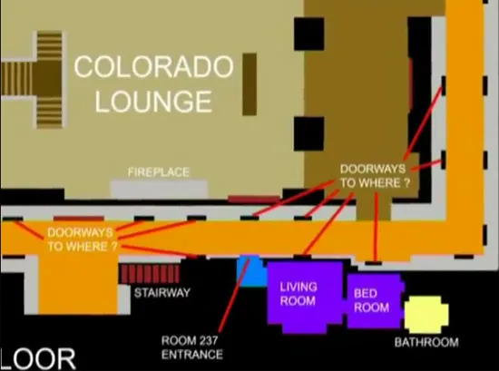
Stanley Kubrik’s excellent horror film The Shining has been unnerving audiences for over two decades. Between command performances by Jack Nicholson and the entire cast, some strong source material from Stephen King, and brilliant direction, it has maintained a reputation as a truly horrifying movie. But one key aspect of the film is the fact that most of the sets for the Overlook Hotel, the central location for the film, are spatially impossible.
This has long been known, but recently highlighted by Rob Ager, who created two YouTube videos on the subject. He says that the impossible nature of the hotel was first brought to his attention by an acquaintance who attempted to create an Overlook Hotel map for the original Duke Nukem. This led Ager to conduct an exhaustive study of the film, and visit the Kubrik archives in London to see the original plans for the sets. Ager confirmed that the hotel is packed with impossible windows, doors that lead to nowhere, and whole rooms that cannot exist inside the hotel.
Now, you may think that these are simple continuity errors to be relegated to the “goofs” section on IMDB, but that’s just not Kubrick’s style. For instance, when making his excellent dark comedy Dr. Strangelove, Kubrick perfectly recreated the then-classified interior of an American bomber without having ever seen it. His attention to detail and painstaking style of film making is well documented, which just about rules the bizarre sets used in The Shining out as mere accidents.
Ager believes, and I am inclined to agree with him, that the spatial madness is entirely intentional. The Shining is a horror movie, but one that relies as much on atmosphere and tension as it does on shock and gore. As the camera weaves around the labyrinthine Overlook, the viewer is disoriented and the set feels inescapable and overwhelming. It’s an otherworldly film, and without ever directly acknowledging it in the movie itself, Kubrick projects that sense to the viewer.
Ager’s videos are a fascinating dissection of the film, and a wonderfully thorough look at how Kubrick used this particular effect. This alone forgives them for being about ten minutes each. Consider them your required viewing of the day.
(via Daring Fireball)
Have a tip we should know? [email protected]
