The Legend of Zelda: The Wind Waker and Twilight Princess: An Artistic Showdown
Becoming the brand.
The following was originally posted on Mary Lee Sauder’s blog The Story Campaign and has been republished with permission.
I’ve been on a Zelda kick lately. So to satiate my craving, I powered through Ocarina of Time 3D (wow, that water temple sure got streamlined), replayed Majora’s Mask, and finally picked up A Link Between Worlds. And this got me to thinking—Ocarina of Time’s value in the grand scheme of things is not so much as a self-contained game anymore.
Yes, I still find it fun to play, but other games in the series have largely surpassed it in terms of story and gameplay (just watch Egoraptor’s Sequelitis for a sobering look at some of the problems Ocarina had that we never noticed). But what makes Ocarina of Time still important now is that it has thoroughly defined the Zelda brand for 16 years and counting.
Brand identity is invaluable to a video game series. And even though Zelda as a game franchise has been around since the ‘80s, it wasn’t until the release of Ocarina of Time for the Nintendo 64 in 1998 that it truly became a household name. Today, Ocarina has sold over 7.6 million copies worldwide, not including the ports or remakes, making it the highest-selling Zelda game ever. And due to its huge popularity, it served as the introduction for a lot of people (including me) to the Zelda universe.
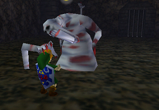
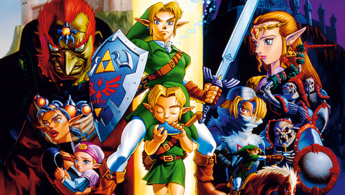
Ocarina of Time had a strong visual aesthetic. It introduced the groundbreaking adult Link and Zelda, plus the human version of Ganon. Even so, this game mostly stuck to the art style of previous installments like A Link to the Past and the original Legend of Zelda, just transitioned into 3D—an anime-style medieval fantasy world with unique creatures and childhood-haunting monsters.
Imagine, then, the amount of pressure that the developers of the next Zelda game were under to create an aesthetic that would define the series after the juggernaut that was Ocarina (and its direct sequel, Majora’s Mask, which used many of the same art assets). Would they try to capture the same iconic style as the Nintendo 64 titles, but update it to current graphical standards? Or would they try something completely different in an attempt to make lightning strike twice? Well… they did both. But not in that order.
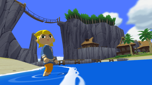
The Wind Waker was the first real successor to Ocarina of Time. It was the first game in the series for the GameCube, so it absolutely needed to mark itself as the Zelda of the new generation. For this challenge, Wind Waker decided to pioneer a visual aesthetic that was a radical departure from what everyone knew Zelda to be–it was bright, flat, and cartoony, giving exaggerated features and distinctive silhouettes to main characters and enemies alike.
At the time, this style garnered a mixed response from the gaming public. Why does the game look so “kiddy” now? What happened to the adult characters and themes from the N64 titles? This looks so weird! Everyone was hoping for an updated version of what they had seen before, but they got the quirky and vastly different style of Wind Waker instead. Luckily, most people have warmed up to the cartoony versions of the Zelda characters now, due in no small part to the fact that the cel-shaded graphics still manage to look good over a decade later.
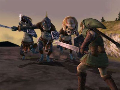
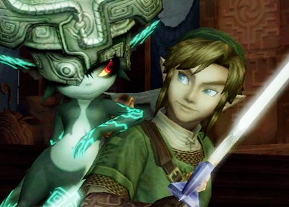
And then, a few years later, Twilight Princess was released. This game was supposed to codify the look of the “mature” Zelda game. Finally, gamers got their updated versions of adult Link and Zelda. They also got a vast new world filled with darker designs and an ethereal atmosphere. This direction was highly praised by gamers at the time, but there’s something… odd about the legacy of Twilight Princess as compared to that of Wind Waker.
Here’s a little exercise. Try to think of ten memorable character designs fromWind Waker as fast as you can. Easy, right? Link, Tetra, the boat, the Helmaroc King, the Ritos, the Deku Tree, the Koroks, the Great Fairies, the Moblins, the Darknuts… the list goes on and on. Now try it again with Twilight Princess. Link counts, certainly. And Zelda. Midna for sure. Zant, maybe. That creepy chicken thing? Ganon? …Anyone remember any of the enemies in this game?
See, the thing about art design in relation to a brand is that it has to be instantly recognizable or it just isn’t doing its job. Wind Waker’s style may not have been what gamers were expecting after the monumental impact of Ocarina of Time, but it holds up better than Twilight Princess in retrospect because it was colorful, punchy, and most importantly… memorable. Twilight Princess gave everyone what they wanted, but it got stuck in this sort of mid-2000s washed out palette with too much bloom lighting and expressionless, joyless characters. Its only lasting contributions to the art style of Zelda were the updated redesigns of adult Link and Zelda, plus Midna as the odd, interesting design in a sea of drab safe bets.
This has nothing to do with the actual quality of these two games, by the way. Personally, I think that they both stand up well today but also suffer from some pacing problems and don’t have quite as much meat on their bones as they should. But the extent to which their respective art styles influenced their successors is plain to see.
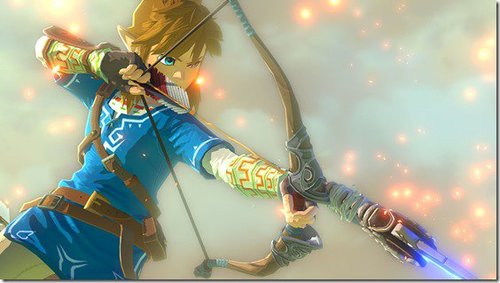
Skyward Sword, A Link Between Worlds, and even the as yet unnamed Wii U Zelda title teased at E3 this year clearly draw from the bright and cartoony aesthetic of Wind Waker much more than they do the darker style of Twilight Princess. These games tone down the extreme exaggeration that defined Wind Waker in favor of a bit more realism, but it’s obvious that the designs of Ocarina’s quirky stepsibling have worked their way into many of the newer Zelda games. Twilight Princess’ influence, on the other hand, is limited mostly to the design of adult Link and Zelda. Though, to be fair, those designs are so iconic that they’re still being used in the new Super Smash Bros. and Hyrule Warriors (to an extent) even today.
So which game managed to “become the brand” after Ocarina of Time so firmly defined it for an entire generation? In my opinion, the victory clearly goes to Wind Waker, and for good reason. Zelda games, no matter what their story or themes, just tend to feel more colorful and alive these days. In the future, perhaps another game will make a radical departure from that and we’ll get to see a truly memorable melancholy Zelda art style. I would love to see that, but I do have one request in advance—please turn down the bloom.
Mary Lee Sauder (@MLStoryCampaign) is a longtime gamer and an even longer time writer. She runs the editorial blog The Story Campaign, where she writes about video games, anime, and storytelling every week.
Are you following The Mary Sue on Twitter, Facebook, Tumblr, Pinterest, & Google +?
Have a tip we should know? [email protected]
