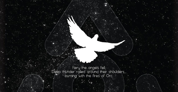
6 Movie Posters That Think Outside-The-Box

eye candy

Recommended Videos

Movie posters tend to fall in the same, boring design scheme. The stars looking off into the distance or a simple logo with a lame tagline. What we wouldn’t give for Hollywood to search the internet and hire some folks who really know how to design with inspiration. Here are a few such examples. 

I think the Black Swan one is my favorite, what’s yours?

(via Wired)

Previously in Movie Posters

Have a tip we should know? tips@themarysue.com

Author
Jill Pantozzi
Jill Pantozzi is a pop-culture journalist and host who writes about all things nerdy and beyond! She’s Editor in Chief of the geek girl culture site The Mary Sue (Abrams Media Network), and hosts her own blog “Has Boobs, Reads Comics” (TheNerdyBird.com). She co-hosts the Crazy Sexy Geeks podcast along with superhero historian Alan Kistler, contributed to a book of essays titled “Chicks Read Comics,” (Mad Norwegian Press) and had her first comic book story in the IDW anthology, “Womanthology.” In 2012, she was featured on National Geographic’s "Comic Store Heroes," a documentary on the lives of comic book fans and the following year she was one of many Batman fans profiled in the documentary, "Legends of the Knight."

Filed Under:

Follow The Mary Sue:

Exit mobile version