We Go Hands On With Feedly’s Redesigned App, See If It Can Replace That Other Reader
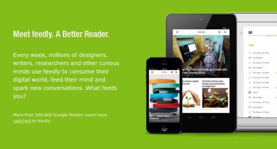
We’ve all been clamoring to find a new RSS reader since Google gave their Google Reader service a death sentence. In the first two days since Google’s announcement, more than half a million Reader users defected by signing up with Feedly. The service started listening to their new users about what they can do better, and it looks like they took the suggestions to heart, because Feedly just launched new versions of their apps. I had an early look at the updates for Android and Firefox, and they’re pretty great.
When the news that they gained half a million new users came out, I tried Feedly. It worked well, but I kept going back to Google Reader whenever I found something too different. I’m a creature of habit, and I’ve been using Google Reader roughly eight hours a day since starting here at Geekosystem. Getting used to a new RSS reader has been a challenge, but Feedly is surprisingly flexible.
When the folks at Feedly offered me an early look at their Android app as well as their updated Firefox plug-in, I decided to commit to trying just Feedly for a few days of work to see how it held up. At first it was a test to see how much like Google Reader I could make Feedly look, but the more I used it the more I started to appreciate Feedly for what it is.
It’s not perfect, but considering how quickly they’ve adapted themselves to a sudden influx of new users, which crossed the 3 million mark since the Google Reader announcement, and how open they are to feedback from users (and bloggers) Feedly could very well grow into something you love. Which is important, because Google Reader’s condition is terminal, and in a few short weeks it will be gone whether we like it or not. (We do not.)
I never gave earlier versions of Feedly more than a cursory glance, but a press release they sent outlined the changes to the new apps. Their search feature was rebuilt completely to allow faster, more helpful searches, and the test searches I tried were quick and gave me what I was expecting to find. The search has “smart topic completion” which takes information from the Feedly community to help you find the best feeds in a particular category. The more you use it, the better it gets.
They’ve added a “Must Reads” feature to make sure you don’t miss anything from your most important feed sources like Geekosystem, and it’s tremendously helpful. There are hundreds of feeds in my list, but most of them I don’t get much use out of. “Must Reads” is a great way to make sure I’m seeing things from the sources I’m most interested in.
The biggest “make this more like Google Reader” feature seems to be that they’ve added a headline-only view. This indeed makes it more like Google Reader, and specifically more like how I had Google Reader configured, but I’m finding myself gravitating towards Feedly’s “Magazine View” more than the headlines. It gives the headline, picture, and a brief excerpt without taking up too much screen space.
Feedly has also updated how easy it is for users to share stories from their reader with their various social media accounts. That’s great since it helps you share Geekosystem articles with all your Facebook, Twitter, and Google+ friends, but they’ve also worked in pretty simple Instapaper integration so you can easily save stories you find in Feedly for later when you’re offline.
The Feedly Firefox plug-in is reasonably straight-forward. My feeds imported seamlessly from Google Reader and I didn’t have to go through and re-add anything, which is great because the legacy list of feeds I inherited from past Geekosystem writers is huge. It is called Humbaba, whose name means hugeness.
After playing with the settings for a while, and after a few back-and-forths with the folks at Feedly where I disguised my questions as feature suggestions, I got things pretty much how I had them in Google Reader. I also found out that most of the things I thought were missing from Feedly were there all along, and just it a menu I didn’t notice. There’s a small, easily missed menu under your name that says “prefs.” That’s where all the good stuff is, not under the much larger gear icon on the other side of the screen like I thought.
The Android app for Feedly is beautiful, and like I said in my last article about the service, that’s not necessarily that helpful to me, but it’s certainly not a bad thing. The default settings the app has when I first opened it are bananas. There’s a “stack” method of transitioning through a list of articles from a feed where instead of scrolling you flip through pages. You can easily switch it to traditional up-and-down scrolling or even side-to-side scrolling if that’s what you’re into. There were a few other default settings that I didn’t care for, but the great thing about Feedly is that you don’t have to use them.
Changing something you don’t like about Feedly is surprisingly simple. With this update you can get it to run the gamut of very clean and simple text-headlines-only reader to a full-featured rich news media experience. Since most of us have needs that fall somewhere in between, it’s very likely that with a little customization you can get Feedly to fill that Google-Reader-sized hole in your heart come July.
(via Feedly)
Relevant to your interests
Have a tip we should know? tips@themarysue.com
