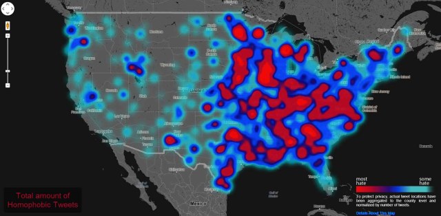
Geography of Hate Map Reveals Locations for Homophobic and Racist Tweets Across the United States

In case you needed a dose of depressing news today, here’s some for you: Research site Floating Sheep’s built a map of homophobia, racism, and ableism across the United States in the form of geotagged tweets. It’s about as horrifying as you’d expect, and this doesn’t even include accidental or comedic references to any of this stuff. This map is only straight-up intentional instances of hate.
This all stems back to an earlier Floating Sheep project where they connected President Obama with racial slurs, but this time they’ve really outdone themselves. How do they know this data is only representative of intentional hate? They had a group of Humboldt State University students sort through them all and discard any that weren’t considered derogatory. Floating Sheep’s detailed all their methodology here, and it’s a fascinating and recommended read.
The map itself gets pretty granular, letting you highlight only certain specific slurs or kinds of discrimination. It goes from “some hate” to “most hate” with light blue being the former and bright red being the latter. The gray everywhere else just means there wasn’t any geotagged tweets for whatever specific discrimination is currently being presented.
This obviously isn’t representative of all discrimination on Twitter since not every tweet gets geotagged, but it’s illuminating nonetheless.
(Hate Map via Floating Sheep via The Verge)
- Drink and drive in Minneapolis or St. Paul and your name could end up on Twitter
- Comedian Rob Delaney takes control of MLB Twitter account, hilarity ensues
- Stop what you’re doing and go follow Mel Brooks on Twitter
Have a tip we should know? tips@themarysue.com