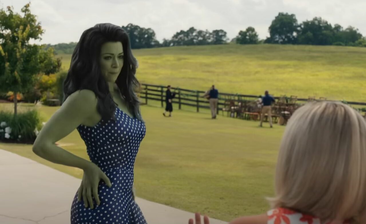
She-Hulk Animation Discourse Reflects Back on The Original 2019 ‘Sonic The Hedgehog’ Trailer Backlash
I wouldn't be mad at a delay.

Last week the highly-anticipated trailer for the Disney+’s She-Hulk show (She-Hulk: Attorney at Law) was released to mixed reactions. Beyond the love for a few scenes and the show’s tone, everyone was baffled by how the green version of famed lawyer and cousin to Bruce Banner, Jessica Walters, a.k.a. She-Hulk, was depicted. When Disney announced Tatiana Maslany was to be Walters, I wasn’t as worried as I was with Gal Gadot’s casting as Wonder Woman. Even though She-Hulk is much larger, there were many ways Marvel Entertainment could approach it.
The best-looking probably would’ve been practical effects in tandem with minimal CGI, like how the Lord of the Rings trilogy used forced perspective shots. Or the use of two or more performers (like the 1970s show in which Bill Bixby played Bruce and Lou Ferrigno played The Hulk) with some facial adjustments using make-up and/or CGI. These would play well to an Earth-bound origin with a day job as a lawyer similar to the Netflix shows. Or, as we recently found out, they could go with, seemingly, total CGI. Again not a red flag, as the slew of Dinsey+ Marvel shows have shown excellent examples of VFX (the combination of CGI and real-world elements.)
However, in this case, ‘excellent’ doesn’t really apply. The She-Hulk animation is strangely slim, unimaginative, and very unpolished despite the time and resources Disney has at its disposal.
Many people online were comparing the poster to Fiona from the Dreamworks’ classic Shrek and Elphaba from the Broadway-smash musical in film-adaptation-development hell Wicked. The Fiona comparison feels unfair because, in that movie, she was rounder. It feels like for every 1,000 model-like women (depicting the “trending” body of the time, be it slim, curvy, or slim-thick) leads in movies, there are 100 round women and maybe one muscular goddess.
VFX artists speak out
One of the immediate reoccurring complaints from those who saw images and the trailer noted how similarly cringy it looked to the original Sonic The Hedgehog trailer in 2019. Now, thanks to Chip ‘n Dale: Rescue Rangers, I’m calling this phenomenon ‘Ugly Sonic.’ It appears they went for a more realistic She-Hulk as if Hulk wasn’t right there free from the bounds of the male gaze. The backlash over She-Hulk wasn’t an immediate “raise your pitchforks” but collective confusion on how to move forward without the VFX team being overworked. There is no evidence the Sonic team was overworked by Paramount for the five-month delay and turnaround, but this is a more significant industry issue.
In a now-deleted account (which fellow TMS writer Kalia Hale-Stern digs into), VFX artist Sean Ruecroft tweeted on May 18, “I was at a company that did VFX for this. Apparently, she was bigger early on, but the notes kept saying to ‘make her smaller.’ We always roll our eyes (like we did on Sonic), but at the end of the day artists gotta follow orders.”
If they kept having to make her body smaller, this would’ve slowed the animation process and probably also explains the unpolished look. Other artists also confirmed this would have been the case, but no one with an identifiable name like Ruecroft went viral.
This is a routine issue with Disney. When everyone was expressing our love for Luisa after the release of Encanto, some artists (like Dylan Ekren) expressed gratitude, as they fought very hard to keep her muscular. You could say they felt the surface pressure to play into feminine beauty standards. Disney was even caught off guard in merchandising because everyone was scrambling to find Luisa toys and party supplies, but they put most of their eggs in the Mirabel and Isabela basket. A classic Star Wars mistake (also owned by Disney.)
Unsure of how to express concern
I’ve been wrestling with how to express my issues with She-Hulk’s character within a second of seeing her. I am in no way critiquing Maslany’s body, just like I wouldn’t be critiquing Mark Ruffalo’s body. I am bothered by the fact that this final product is the most that Marvel was willing to do. Artists regularly make fun of the limitations put on women characters’ body types and shapes, speak up at their job, and then have to make these women smaller, be it muscles or curves.
To be fair, the MCU gets to change whatever they want, and She-Hulk does look similar to the Walters who came on the scene in 1980 and the early 2000s (led by John Byrne). However, it’s still disappointing that artists that want to push storytelling to be equal to comics (which at this point are a decade ahead) in terms of diversity—including body type—but some people in decision-making positions keep shutting it down.
(featured image: Marvel)
—The Mary Sue has a strict comment policy that forbids, but is not limited to, personal insults toward anyone, hate speech, and trolling.—
Have a tip we should know? tips@themarysue.com