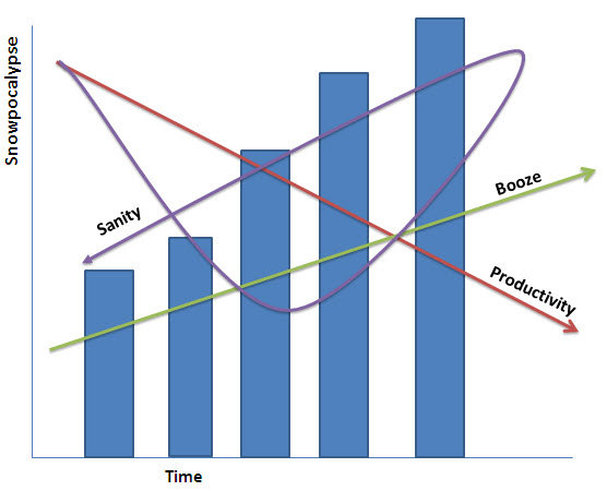
Snowmageddon: the Graph
Feb 11th, 2010, 2:09 pm
Recommended Videos
Extra geeky things to appreciate about this graph:
- The y-axis isn’t labeled in inches of snow or anything like that, but rather in “Snowpocalypse.” I think we can all agree on that.
- Booze has a direct correlation with “Snowpocalypse” and an inverse correlation with productivity.
- Much like actual sanity, sanity as represented in the graph is not a differentiable function.
(via Chart Porn)
Have a tip we should know? tips@themarysue.com
