‘Spider-Man: Across the Spider-Verse’ Is a Love Letter to Animation

Spider-Man: Across the Spider-Verse continues the story of Miles Morales and all the other Spideys of Marvel’s sprawling multiverse, following them as they thwip their way across multiple realities. But Across the Spider-Verse doesn’t just continue an exciting story with lovable characters. It also brings back one of the best things about its predecessor, Spider-Man: Into the Spider-Verse: that amazing animation style.
When Into the Spider-Verse came out in 2018, critics and audiences were blown away by its fresh and beautiful animation. This wasn’t the bland, predictable CGI style we’d all grown so used to. Into the Spider-Verse crackled with energy. It looked like a comic book come to life, complete with thought bubbles and seemingly hand-drawn visual effects.
Of course, the film’s unique style was no accident. The directors, Bob Persichetti, Peter Ramsey and Rodney Rothman, set out from the start to create something that would look and feel new to audiences. From eliminating motion blur to doing away with automated processes that animators had grown used to working with, the directors fought to elevate Into the Spider-Verse from a superhero movie to a work of art.
For fans of the first film, Across the Spider-Verse doesn’t disappoint. In fact, the new film uses six distinct animation styles to paint an eye-popping portrait of the multiverse. Here’s why it works so well.
The Multiverse is a perfect place to showcase different animation styles
Early in the film, Gwen comes upon Adrian Toomes, a.k.a. the Vulture. Except this Vulture is clearly from another reality. “What are you, made of parchment?” she asks, watching the villain flap around the Guggenheim Museum. Indeed, the Vulture looks like a two-dimensional ink drawing come to life.
Throughout the movie, different realities are depicted in different styles. Gwen’s universe is rendered in broad brush strokes and pastels, while Miles’ home of Earth-1610 is rendered in the print comic book style we fell in love with in Into the Spider-Verse.
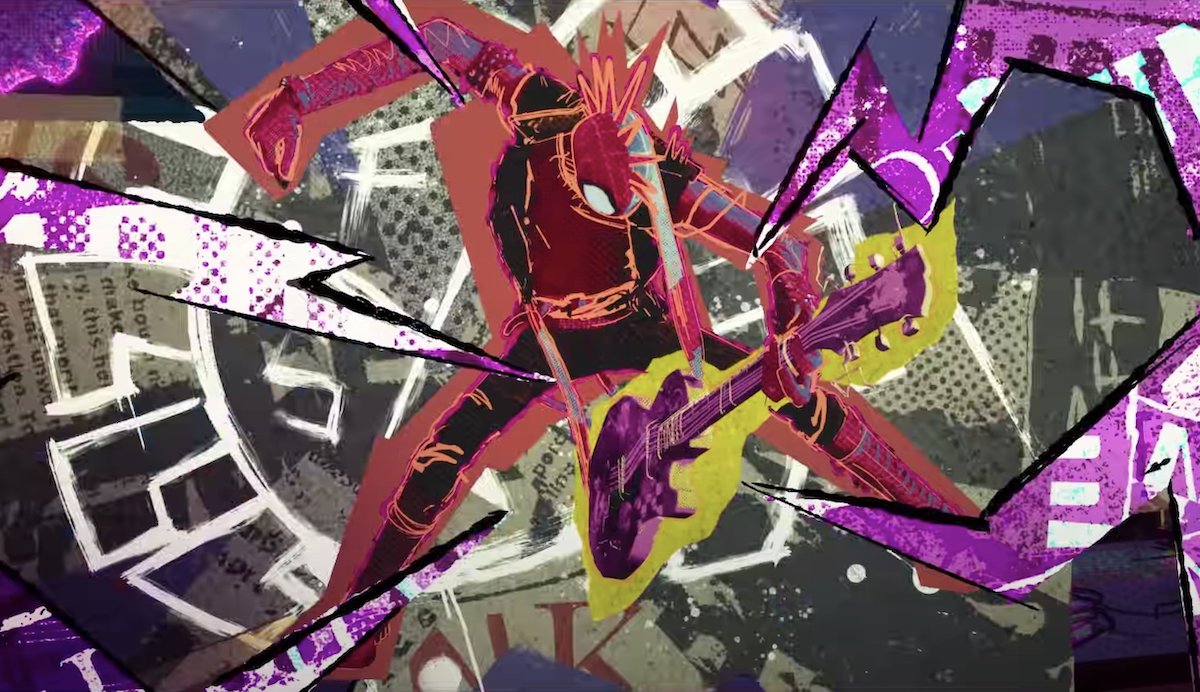
My personal favorite, though, is Hobie Brown, a.k.a. Spider-Punk. It’s hard to describe Hobie’s animation style—he’s sort of like a living zine, or a moving collage. Like if a flyer for a punk show tore itself off the telephone pole it was stapled to, and started shredding on a guitar. True to the spirit of punk, the animators broke some major rules when they animated him. Across the Spider-Verse‘s directors, Justin K. Thompson, Joaquim Dos Santos, and Kemp Powers, described Hobie’s experimental animation style to DiscussingFilm, including one intriguing tidbit:
Spider-Punk’s jacket is animated at a different frame rate oftentimes from the rest of his body. So it’s like sometimes when the perspective shifts hard enough, his jacket will just be held and then it will quickly pop to the next perspective. But his body and his head are moving at a different frame rate. That fact alone is breaking a lot of rules for an animated film.
Good animation doesn’t mimic live action—it speaks its own narrative language
One moment that was praised by fans before the movie even came out is when Miles’ mom Rio, upon finding out that he’s getting a B in Spanish, snaps in his face to show her displeasure. As she snaps, a tiny Puerto Rican flag pops out of her fingers and disappears.
In addition to being a cool and funny visual, Rio’s snap gives us a lot of information. It reminds us that Rio is Puerto Rican, and shows us how important her identity and culture are to her.
There are other great parts in Across the Spider-Verse, too. In one scene, a spider army, complete with a gigantic vehicle, tries to cross one poor Spidey’s web and snaps it. In other, an ATM spits cash into the air, which then rains down on a happy crowd. Both of those gags could have fallen flat if the directors had tried to make the moments look realistic. They work because the film speaks its own language. The animation style lets us know what’s possible in this world.
Lesser animated films don’t understand how much better animation is when it doesn’t try to mimic real life. Sure, you can rotoscope or motion-capture the movements of an actor and make the final product look as similar to that actor as possible. Or you can ask yourself what the world you’re creating would look like if it wasn’t bound by the laws of the world around you.
The Spider-Verse trilogy, Wolfwalkers, The Mitchells vs. the Machines, Moon Girl and Devil Dinosaur—I live for the breathtaking, exhilarating animation in projects like these. With so many lackluster movies and series pumped out every year, animation can feel like a grim landscape sometimes, but I’m glad some creators are still able to innovate.
(featured image: Sony Pictures Entertainment)
Have a tip we should know? tips@themarysue.com