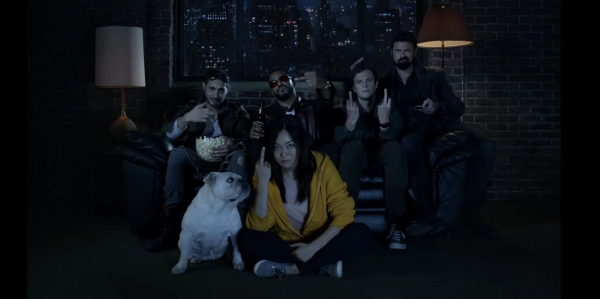
Spider-Man, Turn On the Lights: Why Are Genre Shows So Poorly Lit?
I would love to be able to watch one damn show without squinting at my screen.

Let’s talk about visibility in television. No, I’m not talking about issues of diversity or inclusion (this time); I’m talking about literal visibility, i.e. what my eyeballs can and can’t perceive. Basically, I have trouble seeing what the hell is going on when I watch a superhero show. I may be alone in this “old man yells at cloud” level complaint, but something’s gotta give. I’m tired of squinting at my screen as I rewind fight scenes in dimly lit alleys, and I shouldn’t have to live in black hole to watch my favorite shows.
(Me trying to watch the NYCC trailers, image: NBC)
I blame the rise of dark, gritty comic book adaptations. Ever since Christopher Nolan’s The Dark Knight changed the superhero genre forever, countless creators have attempted to ape the style and feel of the Nolan trilogy, both thematically and visually. While I am all for nihilistic superheroes and existential despair in my comic book adaptations, it feels like creators are leaning too heavily on the lighting department to convey brooding intensity, rather than scripts or performances.
(Is this Gretchen Mol in Nightflyers? No seriously, I’m asking. image: syfy)
It’s especially frustrating in the “serious superhero” genre, as most fight scenes take place under the cover of night. Whatever fight choreography or skilled camera work taking place is rendered obscure by low lighting. Combine that with fast-paced editing, and we’re basically watching a bunch of shadows and blurred movements.
The thing is, it doesn’t have to be this way. With a talented lighting crew and the right camera set-ups and editing, you can make a masterfully effective fight scene in low light. Take, for example, the hallway fight scene from Netflix’s season one of Daredevil. Using shadows, ambient light, and minimal editing, you can create a visceral and moody sequence.
The dim, muddy lighting is even worse when it comes to character scenes, where it’s important to see the actor’s faces. If your audience spends more time struggling to discern basic facial expressions than they do actually absorbing the dialogue and emotion of the scene … that’s not great. Here’s a still of Raven and Robin in a car from Titans trailer, or at least I think it is.
(Raven and Robin in the world’s darkest car image: DC Universe)
While this lighting style may work in a dark movie theater, on a big screen, it suffers on the smaller, more reflective screens of smartphones, laptops, and televisions. Is this an actual issue in genre shows, or is this my eyeballs’ cry for help/Lenscrafters? Do you also have trouble with the poor lighting in these shows, and are we doomed to watch Gotham reruns through a pinhole camera? Share your thoughts/optometrist recs in the comments!
(image: Amazon Prime)
Want more stories like this? Become a subscriber and support the site!
—The Mary Sue has a strict comment policy that forbids, but is not limited to, personal insults toward anyone, hate speech, and trolling.—
Have a tip we should know? tips@themarysue.com