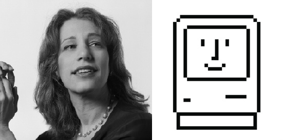
Meet Susan Kare, the Woman Behind Apple’s Icons
This Exists... Because of A Lady

Back in the days of yore when a computer’s interface was, well, less than “friendly” and only understood by the most entrenched computer programmers, a young Steve Jobs took a tour of Xerox PARC. The company was developing a new graphical user interface (GUI) for computers marketed for corporations, but Jobs saw the future: user-friendly, personal computers that used GUI. He quickly licensed the technology so he could create a “democratic” personal computer. Eventually, a young woman with a Ph.D. in fine arts came along and helped to create the fonts and icons that made people fall in love with the Apple interface. That woman was Susan Kare.
Kare started out designing fonts for the Mac OS, including the first ever proportionally spaced font, which looked like this:
Jobs was satisfied with the literary-looking font, and Kare stuck around to start sketching ideas — on graph paper — for the navigational icons that first helped regular people use real, solid technology:
The “Paste” hand:
The “Paint” brush
The “Cut” command icon:
Some things we still see today, like the trashcan:
And the icon on the “Command” button, which was inspired by a symbol used on Swedish maps to indicate an interesting sightseeing location (meant to look like a castle viewed overhead):
Some icons didn’t make it into the interface, but they did find a special home in Mac lore, like this “danger” symbol, which ended up on a flag that was part of an infamous Mac team retreat:
Kare went on to design icons for Windows and IBM, and she’s published a new book with her work over the years, Susan Kare Icons. And if you buy it through her web store, you will get an autographed copy!
Also make sure to visit Kare’s official site.
(PLoS Blogs via Neatorama)
Have a tip we should know? tips@themarysue.com