The First ‘Peter Pan & Wendy’ Trailer Makes Me Wonder Once Again If Disney Has Something Against Good Cinematography
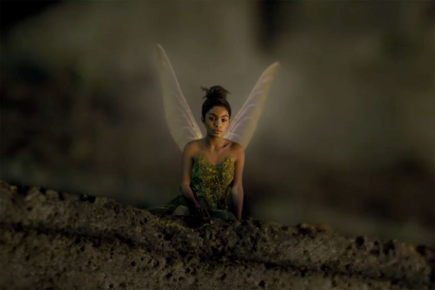
This is Neverland—why does it look drab and gritty?

It’s not news by now that Disney is busy remaking all its animated classics into live-action, ostensibly to bring these beloved stories to new generations but more probably because there are few things easier than capitalising on nostalgia.
The following months will bring us two more of these remakes. The first one is, of course, the much-anticipated The Little Mermaid, starring Halle Bailey in the titular role and coming to cinemas in May. The second one is Peter Pan & Wendy, which will be released on Disney Plus in April and for which the first trailers and promo pictures were just released.
There are actually plenty of elements that would suggest this new iteration of Peter Pan could fare pretty well, unlike some other previous ones—looking at you, Pan. The casting seems solid—relatively newcomers Alexander Molony and Ever Anderson will take on the titular roles of Peter Pan and Wendy respectively while surrounded by more established actors like Jude Law as Captain Hook, Alan Tudyk as Mr Darling, and Yara Shahidi and Tinkerbell. Director David Lowery’s imaginative previous works—from The Green Knight to Pete’s Dragon—are also a good omen, since we’re talking about bringing to life the wondrous island of Neverland.
However, there was one thing in the trailer that was impossible to miss and that is currently making the rounds throughout the Internet: the coloring and lighting this new movie seems to have. So here I am once again asking why oh why is Disney so against using cinematography that conveys to its audiences just how magical all these stories are supposed to be.
Look, I get that one of the major ideas behind these live-action remakes is to make them feel more realistic—that’s why they are live-action, after all. But everything feels so dull. The story of Peter Pan is set on a fantastical island full of mermaids and flying ships, and yet the color palette chosen for this film does absolutely nothing to sell us on how incredible everything should be visually.
Same goes for the lighting—just because Game of Thrones and House of the Dragon have all their scenes plunged in almost complete darkness doesn’t mean that all fantasy stories now need to do the same!
Of course, one might argue that it’s a stylistic choice—one that adds to the overall theme of realism. However, I would argue back that fairytales have no necessity to feel realistic. They’re fairytales: They shouldn’t have the same visual storytelling elements as an MCU movie and I hate that they kind of do.
(featured image: Disney)
Have a tip we should know? tips@themarysue.com