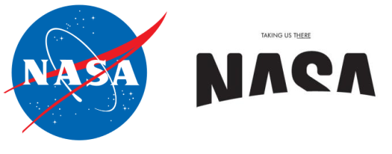
The NASA Logo, Redesigned
When Viewpoint magazine asked design firm BaseNow “If you could redesign any brand, which would it be?” they arrived at an answer quickly and unanimously: NASA.
Base’s view is that NASA’s traditional “meatball” logo isn’t bad, exactly, it’s just that “what looks futuristic today looks passe tomorrow. And of course tomorrow comes faster today than it did yesterday.” We can see their point, after all, who knows today that the red chevron in the logo represents the shape of planned hypersonic airplane wings in 1959? But we’re still not sure if we like their replacement.
Their design is just so… plain. Though not without the possibility of embellishment:
Base intended the letters to be somewhat difficult to parse:
We also wanted to de-emphasize the name in the logo to create more of a symbol that would be universally understood. So we eclipse[sic] the name with a giant sphere, which could be Earth or any other planet. In this way, we don’t get rid of the “meatball”; it’s still there, you just don’t see it.
Hm. This astronaut still looks as if there’s a fold of his suit obscuring the logo.
We have to admit, though. It looks like a really cool alien language when you flip it upside down.
(via Notcot.org.)
Have a tip we should know? tips@themarysue.com
