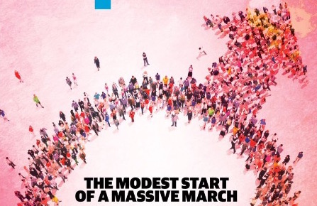
The WaPo Express Made a Giant Gendered Mistake on Their Women’s March Cover
Um, your unconscious bias is showing.

The WaPo Express—The Washington Post’s free daily magazine covering life in D.C.—had a story this morning about the significant impact of the upcoming Women’s March on Washington. Unfortunately, this was their cover, which they tweeted out Thursday morning (see above).
If you haven’t had your coffee yet, and don’t see the screw-up, I’ll give you a moment. Keep looking. It’s like a Magic Eye poster except, as our own Jessica Lachenal put it: instead of a sailboat, it’s a failboat.
Since we apparently need a crash course reminder, these are the symbols for Venus (left) and Mars (right), traditionally used to depict the female (left) and male (again, right) genders.
Oh WaPo, no. Twitter, as is its wont, was not kind.
@WaPoExpress this is what you did, isn’t it? pic.twitter.com/OltXnKQmUI
— Justin Arnold (@JustinOArnold) January 5, 2017
Here, @WaPoExpress – fixed that for you. pic.twitter.com/i9liRDM5S0
— neontaster (@neontaster) January 5, 2017
@WaPoExpresspic.twitter.com/IW2b3zf8CC
— J(an.)-Lat (@JLat55) January 5, 2017
They’ve taken down the tweet, but this is an online and print publication, which is a whole lot harder to make disappear.
And yes, that really was the cover. @WaPoExpress pic.twitter.com/bTzpxq6hiW
— Genevieve Burgess (@rustyheadedgirl) January 5, 2017
Now, everyone makes mistakes. I’ve had more than my fair share of typos and misstatements. (Heck, the Washington Post just had to retract a story about Russian hackers. That’s a pretty big mistake. It happens.) But there’s a big difference between sending out a tweet announcing “today’a cover”—
—or even misspelling erroneously in your apology (because someone is seriously having their worst day ever)—
—and confusing the gender symbols in an article about how marginalized women feel in this country right now.
Listen, everybody makes mistakes. But perhaps this is a sign that @WaPoExpress needs to hire more women in the art dept. ♀ pic.twitter.com/GDHYN5xuy7
— Jessica Valenti (@JessicaValenti) January 5, 2017
@WaPoExpress do you have any women on your edit team
— sara david (@SaraQDavid) January 5, 2017
Also, as The Verge points out, the cover photo is a redesigned stock image photo, poorly photoshopped and made pink.
(Via Shutterstock)
That pink overlay is maybe the most infuriating part.
@WaPoExpress “But I made it pink!” said the designer who picked a stock image featuring the symbol for men to represent a ~women’s~ march.
— Principia 🍍 (@Principia) January 5, 2017
Sure, they want to convey the subject of the story with instantly recognizable images. But the dismissive double whammy of the stereotypical ‘girl color’ (would they have instinctively gone with a blue color for a story about men?) and the wrong gender symbol is hard not to take as a lazy insult. If you’re going to rely on simplistic clichés to represent a great story about an historic movement that has become important to hundreds of thousands of women in America, at least get those clichés right.
This is how the cover should have looked. We apologize for the mistake. pic.twitter.com/MKKOkHPV8T
— Express (@WaPoExpress) January 5, 2017
(image via Washington Post Express)
Want more stories like this? Become a subscriber and support the site!
—The Mary Sue has a strict comment policy that forbids, but is not limited to, personal insults toward anyone, hate speech, and trolling.—
Follow The Mary Sue on Twitter, Facebook, Tumblr, Pinterest, & Google+.
Have a tip we should know? tips@themarysue.com