This Queer Update on an Iconic ‘90s Britney Spears Look Has Me Crying
Oh baby, baby.

In the late nineties, I was a middle schooler whose obsessions were writing and music. Using the money I got from some holiday, I bought the only thing that combined my two loves: a subscription to Rolling Stone magazine. Yes, I got a real-life magazine filled with the latest music news and opinions delivered to my house on a regular basis. It was heaven.
One of the first issues I received was the now-iconic April 1999 Britney Spears cover. You know the one, where she’s lying on pink sheets in a bra and boy-shorts underwear with a white button-up draped around her. In one hand, she holds a corded phone, and a Teletubby in the other. After its debut, it was everywhere, from Rolling Stone advertisements to full-size posters. And now, some 23 years later, the image is back but done way better than the original, thanks to the iconic Harvey Guillén.
The magazine cover I always wanted to see
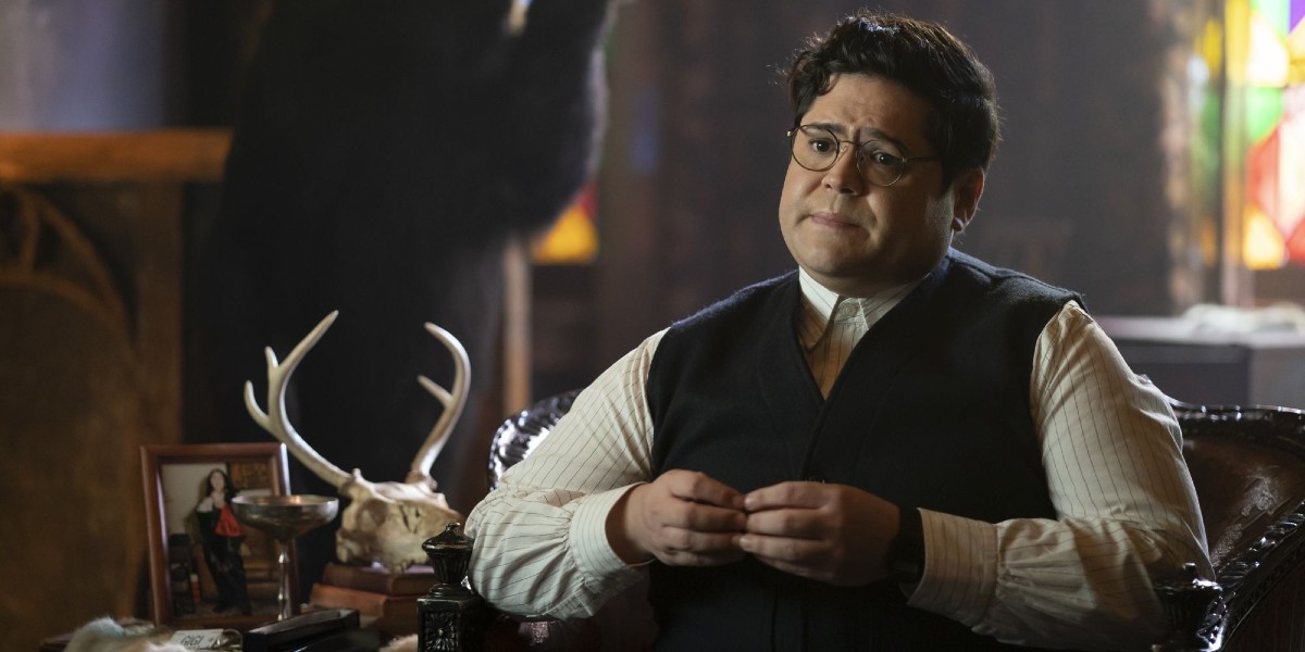
Most people may recognize Harvey Guillén as the vampire familiar/vampire hunter Guillermo on FX’s What We Do in the Shadows. Beyond the hit series, Guillén is a legend who isn’t afraid to show the world who he really is. For the year-end issue of The Advocate, he recreated the famous Spears cover image. In an almost identical outfit to the one Spears wore, Guillén gives a sultry look to the camera and delivers a flawless image. He told The Advocate, “And being a person of size, as a child, I never saw someone like me on a cover in that pose. Given the chance, I jumped to it. I want to show that little Harvey out there to love their body and to not let anyone dim their light.”
Honestly, Guillén’s take on the photo, tossing out traditional gender rules and celebrating his bigger body, was everything young me needed to see as an impressionable kid. As a girl who would never look like Britney Spears and felt alienated from society’s definition of femininity, the cover never really resonated with me. Instead of just being a cool image, it was a reminder of what I would never be. (Also, it kind of grossly hyper-sexualized a 17-year-old girl, which no one seemed to take issue with at the time.)
I wouldn’t say that one cover is necessarily better than the other. Both images show a lot about the eras in which they were taken. Both have people trying to live their best lives. But for me (and probably many others), Guillén gave us a photo we can see ourselves in, and even more so, something to help us see that we should celebrate ourselves, no matter what society may tell us.
(featured image: FX)
Have a tip we should know? tips@themarysue.com