Review: Tokyoflash’s Kisai On Air
Earlier, we took a look at Tokyoflash’s analog Uzumaki watch — which artfully obfuscated the time while keeping it digital. This time we look at the Kisai On Air watch. This handsome fellow sports a touch screen, sleek design, and a beautifully shiny acetate housing. But will it stand up to Max’s snobbery?
Between the those of us at Geekosystem that tried out these watches, I was definitely going to be the hard sell. Mostly because I have worn the same watch for years and long ago came to the conclusion that it was the perfect watch for me. The On Air had a mountain to climb for me to actually like it, and it didn’t really make it. However, I think that’s mostly me.
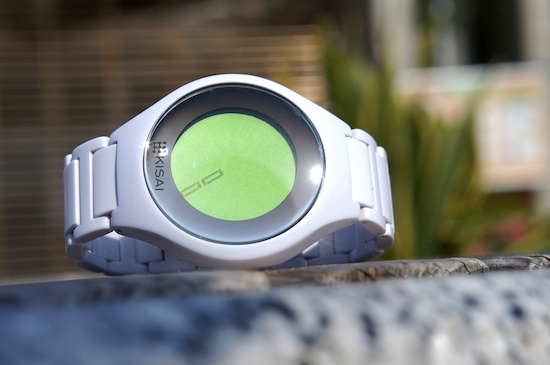
Like all Tokyoflash offerings, the On Air displays the time in a unique way. Of the watches we looked at, mine was definitely the easiest to grasp conceptually. Though the watch is digital, it still uses the traditional circular watch face and number positions — however, those numbers are absent. As are the second and minute hands. Instead, the minutes are oriented to the hour. So at 1:15 PM, the number “15” is oriented at the one o’clock position.
Cleverly, the watch designers display the date in the same manner as the time — the hour position is the month and the days take the place of the minutes.
As an analog watch user, it was really easy to grasp. However, it was surprisingly hard to read in practice. For one thing, only a very small Kisai logo differentiates the top of the watch from the bottom. This small indicator was apparently not enough for me, and I was frequently putting the watch on upside-down and not noticing — and consequently, being about six hours off.
For another thing, I struggled with the orientation of the numbers. When the minutes are displayed on the right half of the watch, they read from the center out. For all times after six o’clock, the numbers are read from the outside in. This is really tricky, and not the fault of the designer; really, there’s no better way to present the numbers. That said, I really did struggle with it.
However, I did find that it became far more intuitive with time. Not surprisingly, it’s a watch you have to get used to.
I actually found that I really liked wearing the watch. The band is made of crisp, white, interlocking segments — which means that it must be sized. However, the snug feeling and slick appearance was a welcome change from my normal timepiece. The center-snap watchband is snazzy, and really makes my belt-buckle band feel clunky and awkward. That sleeker design is perfect for someone like me who spends a great deal of time typing. When working, I have to take my regular watch off; the On Air I could leave on all day.
The On Air also is pleasantly hefty, which is something I really value in the watch. And though the large watch face is not my style, I had to admire its sleek, futuristic design. It’s like having an iPhone on my wrist.
In fact, the iPhone comparison is two-fold as the other feature touted by the On Air is that it has a touchscreen display. This allowed the designers to pack in the features you’d expect in a digital watch — programable alarms, easy to change time, illuminated display, etc. — into the On Air without having to include buttons.
The potential of the touchscreen is, however, poorly realized and this is the only true failing of the watch. In my use I found the touchscreen to be unresponsive and unforgiving. Illuminating it would often take several attempts, but I somehow managed to turn the light on by accident at every opportunity. Swiping from left to right across the screen — ala the iPhone lock screen — gives you access to the settings. But again, I had to try repeatedly to get the watch to recognize my touch, though it mysteriously “unlocks” by accident all the time.
And while the clever time display works as a watch, sticking with it as a means for programming something like, say, an alarm is an exercise in frustration. However, I am sure that this would become easier the more I used the watch, just as reading the face did.
I’m going to be looking back fondly on my time with the On Air. As someone who is very stuck in his ways, it was a welcome change — and even a challenge. And it looks pretty damn cool to boot, and that’s not really something I am used to. However, the difficult interactions definitely turned me off. Also, I found myself missing the ease of my analog watch — a simple glance tells me the date and time, while I frequently puzzled over the On Air face and had to dive into its irritating menu to find the date.
At the end of the day, I will happily go back to my normal watch. However, I will be far, far more likely to grab something as snazzy as the On Air in the future — though perhaps something a little more tailored to my taste.
Pros:
- Looks pretty sweet
- Nice weight, nice feel, pleasant to wear
- Screen is neat and pretty easy to read
Cons:
- Touchscreen actually makes it harder to use
Overall:
I can dig this watch, but the minimalist style and dodgy touchscreen turn me off. I much prefer a more utilitarian watch that can show me all the information I need at a glance.
(Images via Tokyoflash)
- James reviews the Uzumaki analog watch
- Remember when Swatch tried to reinvent time to sell you crazy watches?
Have a tip we should know? tips@themarysue.com
