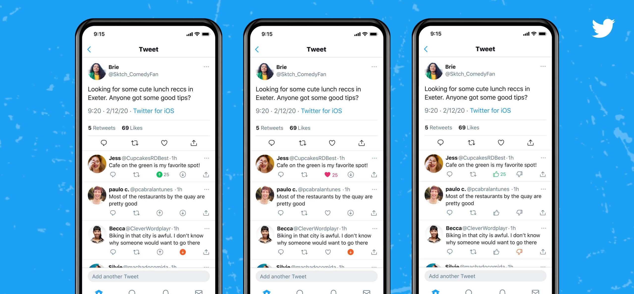
No, Twitter Isn’t Testing Out a Dislike Button That No One Asked For, It’s a Downvote Button That No One Asked For
Pretty sure it's gonna get treated like a dislike button.

Twitter, the social media platform that continues to release features that no one asked for, is experimenting with a new feature that, wait for it, no one asked for.
While we constantly dunk on things like the impending demise of fleets, this particular feature is an immediate recipe for disaster.
Twitter is testing Dislike buttons 👎
(via @iglehart97) pic.twitter.com/7TRAb5LlzT
— Culture Crave 🍿 (@CultureCrave) July 21, 2021
Now, to be fair (not really, because this is still a bad idea), it’s not actually a dislike button.
It’s a downvote button.
I think?
twitter: this is not a dislike button.
also twitter: pic.twitter.com/xubLy6J3rV
— Sloane (@SloaneFragment) July 21, 2021
Okay, so Twitter says its a downvote button. They explain it right here:
Hey Nicholas, this is part of an experiment to give you the option to up or down vote a reply and help us better understand the types of replies you find relevant in a conversation. More info: https://t.co/g8LcTpQqDv
— Twitter Support (@TwitterSupport) July 21, 2021
Some key notes about this experiment:
1. This is just a test for research right now.
2. This is not a dislike button.
3. Your downvotes are visible to you only.
4. Votes won’t change the order of replies.— Twitter Support (@TwitterSupport) July 21, 2021
Even with that explanation, word spread pretty quickly that Twitter was launching a dislike button because, well, when you have a platform that’s only had a like button you assume that the identical icon next to it is a dislike button. You assume that Twitter just came up with a way for people to go from leaving terrible comments on your “I feel good about myself today” post, to hitting a button and, let’s be real, leaving terrible comments anyway.
Twice the animosity at half the cost.
Yay, let’s make everyone on Twitter feel more depressed and self conscious! pic.twitter.com/Jh2L2viJ6p
— Daniel Peckett (@daniel_peckett) July 21, 2021
we literally asked for an edit button and they’re giving us this? pic.twitter.com/6whNf1Ozac
— george (@spfanlana) July 21, 2021
When you post a selfie on Twitter and someone clicks the dislike button. pic.twitter.com/gLZcQ3VvvA
— NUFF (@nuffsaidny) July 21, 2021
Honestly, what’s the difference between a dislike and a downvote button on a platform like Twitter?
This isn’t quite a dislike button. In this research experiment, the thumbs down icon is a down vote that lets us know that you think the reply isn’t relevant to the conversation. We want to better understand the types of replies you do and don’t find relevant in a convo.
— Twitter Support (@TwitterSupport) July 21, 2021
Do we need an “only visible to the user” button that tells Twitter what we don’t want to see? Isn’t that what muting and blocking is for? Haven’t we been downvoting things on Twitter in our own way this entire time?
Who asked for this?!
Listen Twitter, no one is going to look at the thumbs down icon and say, “This isn’t relevant to the conversation.” Even if it’s only visible to them, it’s going to be used as a dislike button, so much so that I bet people would screencap the icon and post in a comment thread just to let that person know that they don’t like their cat or selfie or art or opinion on the rights of marginalized folks or (insert everything we post about on Twitter).
This is yet another Twitter feature that feels like it came out of nowhere.
Twitter will probably release it anyway.
what we want: being able to choose who can quote our tweets to not have to deal with bullies
what you give: more options for bullies
— slawia ❂🧷 (@emocasifer) July 21, 2021
(Image: Twitter)
Want more stories like this? Become a subscriber and support the site!
—The Mary Sue has a strict comment policy that forbids, but is not limited to, personal insults toward anyone, hate speech, and trolling.—
Have a tip we should know? tips@themarysue.com