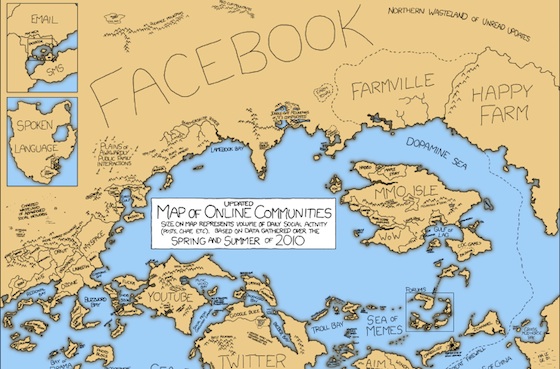
xkcd’s Updated Map of Online Communities
Today’s xkcd consists of a massive overhaul of the webcomic’s famous 2007 map of online communities. Per author Randall Munroe‘s description a lot of work went into making this new map, from stat-crunching to sysadmin-cajoling. Aside from all of the new names on the map (including our sister site Mediaite, which launched just last year, but is now ensconced right between the liberal and conservative blogs, at the mouth of the Sea of Flame), the most interesting thing about this map is that Munroe has discarded raw traffic as his main metric. Instead, this is a map of “total social activity in a community.”
Communities rise and fall, and total membership numbers are no longer a good measure of a community’s current size and health. This updated map uses size to represent total social activity in a community – that is, how much talking, playing, sharing, or other socializing happens there. This meant some comparing of apples and oranges, but I did my best and tried to be consistent.
Estimates are based on the best numbers I could find, but involved a great deal of guesswork, statistical inference, random sampling, nonrandom sampling, a 20,000-cell spreadsheet, emailing, cajoling, tea-leaf reading, goat sacrifices, and gut instinct. (i.e. making things up.)
Sources of data include Google and Bing, Wikipedia, Alexa, Big-Boards.com, StumbleUpon, WordPress, Akismet, every website statistics page I could find, press releases, news articles, and individual site employees. Thanks in particular to folks at last.fm, LiveJournal, Reddit, and the New York Times, as well as sysadmins at a number of sites who shared statistics on condition of anonymity.
>>>Check out the fully sized map.
Have a tip we should know? tips@themarysue.com
