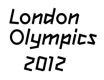
The 2012 London Olympics is just warming up, but it seems we’re already primed to set our sights on Rio for the 2016 Olympics. Here, we have our first glimpse of the beautiful flowing lines that are the official typeface for the Rio 2016 Olympics. Aren’t they beautiful? I kind of wish they would just use it for the 2012 Olympics so we don’t have to look at the awfully “edgy” things anymore.
The Rio 2016 font was designed by Dalton Maag for the 2016 Olympics, and drew its inspiration from the spirit of the Olympics and the soul of the people of Rio (naturally).
Each letter expresses a characteristic of the Rio 2016™ Games, its people and the city. The letters are written in single continuous strokes, with fast and fluid motions, suggesting the movements of the athletes in action. The strong contrast between thick and thin strokes was explored during the design process by putting brush to paper and writing by hand. The variety of the curves in the different letters has a unique informality, inspired by the joyfulness of the Brazilian people.
It is thoughtful, clever, and most importantly, very pleasant to look at – adjectives that were rarely used for the 2012 London Olympics font, which was once described as “a font that looks like a group of primary schoolchildren has designed it during a wet lunch break.”

I’m sorry you had to see that. Here, have an entire gallery of proper typefaces.
[geekovision id=110]
(Rio 2016 via The Next Web)


Published: Jul 24, 2012 05:53 pm