Recommended Videos
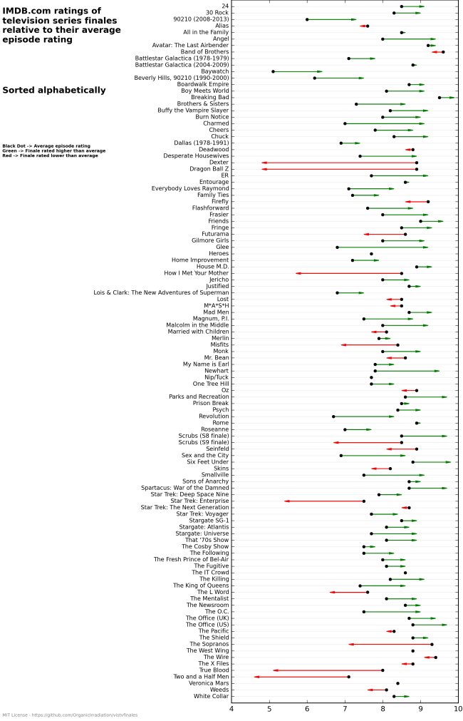
You deserve everything you get, True Blood and elderly Ted.
An intrepid Imgur user has posted a chart that uses a series finale’s IMDB ratings to indicate its reception. A green line indicates “finale rated higher than average,” and a red line indicates “finale rated lower than average”.
Do you agree with The Chart, or does The Chart lie?
—Please make note of The Mary Sue’s general comment policy.—
Do you follow The Mary Sue on Twitter, Facebook, Tumblr, Pinterest, & Google +?
The Mary Sue is supported by our audience. When you purchase through links on our site, we may earn a small affiliate commission. Learn more about our Affiliate Policy


Published: Aug 20, 2015 12:09 pm