Even though Gmail isn’t particularly cluttered or ugly (aside from that bar on the left, maybe?), Google has decided to spruce it up a bit, making it even easier on the eyes. Currently, they’ve only released two new themes for the service, but it is part of a larger plan that was announced on the Official Gmail Blog quickly outlining their intent of visually upgrading Gmail through a series of interface updates.
One of the two released themes, “Preview” and “Preview (Dense),” can be seen above, sporting an easy-to-read, cleaner, minimalistic style. The Gmail team explains that there are two version of the new theme because, eventually, Gmail’s interface will dynamically expand depending upon screen size and user interface preferences. Both of the new themes can be found in the theme tab within Gmail’s settings.
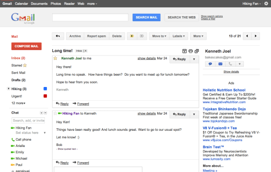
Here is a screenshot of the new theme in conversation view:
Again, not particularly revolutionary, but cleaner and a little more modern. The Gmail team will also be launching some new themes with the same cleaner, more modern design principles within the coming months, including ones attuned to a darker work environment.
(via Gmail Blog)


Published: Jul 1, 2011 09:50 am