So, I bit the bullet today: I switched my Gmail over to the new look. I figured I’ll have to do it sometime, and I might as well do it now, while I’m shaking up all my old habits with fancy labs. If you remember, sharebros were not too happy about the Google Reader redesign, and even more people are likely to be miffed by the Gmail one. According to Google it’s “cleaner and more modern,” which apparently means “has a lot of white space where useful information used to live.” For the moment, you can stick with the old look, but there’s also a display mechanism built in that looks a lot more like traditional Gmail without straight-up being the old format. It’ll come in handy when they kill off the old one for good.
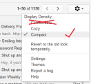
 When you first boot up the new look, it’s in what is called the “Comfortable” density setting, meaning that each and every email is sprawled out across half the screen. It’s not comfortable. This change instantly makes new Gmail feel awful. All you have to do to rectify this is to jump into settings (that Gears of War-ish cog in the hot bar) and switch it over to “Compact,” which could probably be more accurately labeled “Normal.” This shrinks things back down to familiarity.
Granted, there’s no way to get your good old-fashioned hot bar back, but some changes are for the better. This default spacing change is for the worse, but you can fix that at least. When it comes to the rest of them, trust Google, I guess. That, or get a dedicated email client and pretend you’re still living in the past.
- Remember that black bar you hated so much?
- The first inklings of this new look
- You can use the same tactic on Google Reader


Published: Dec 5, 2011 05:20 pm