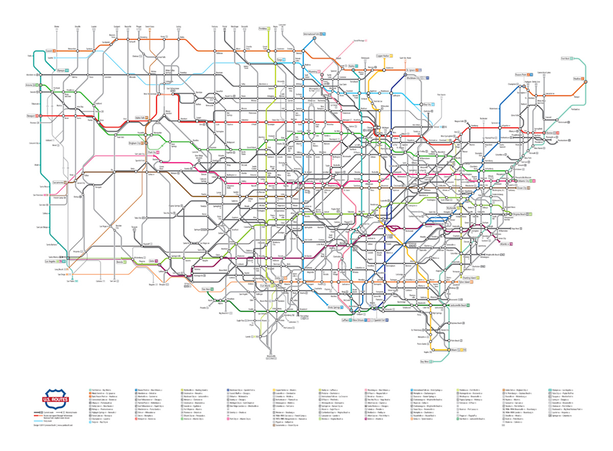
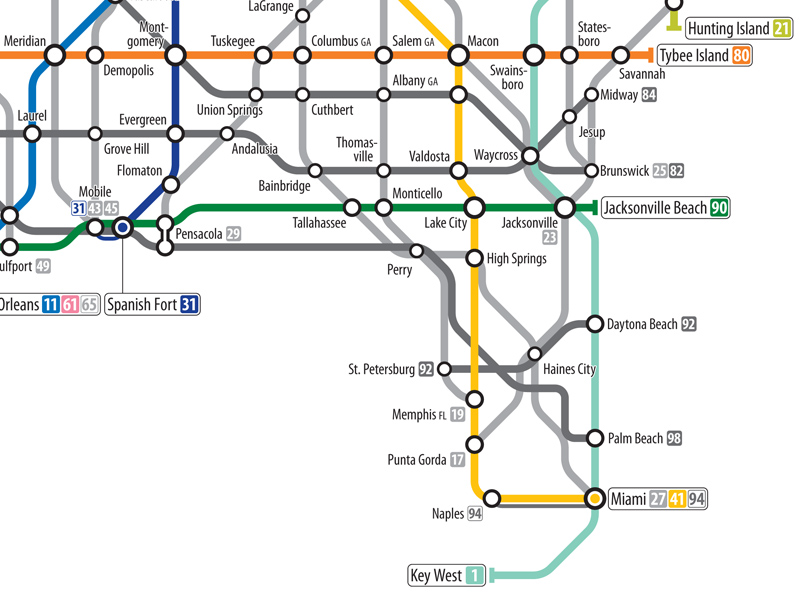
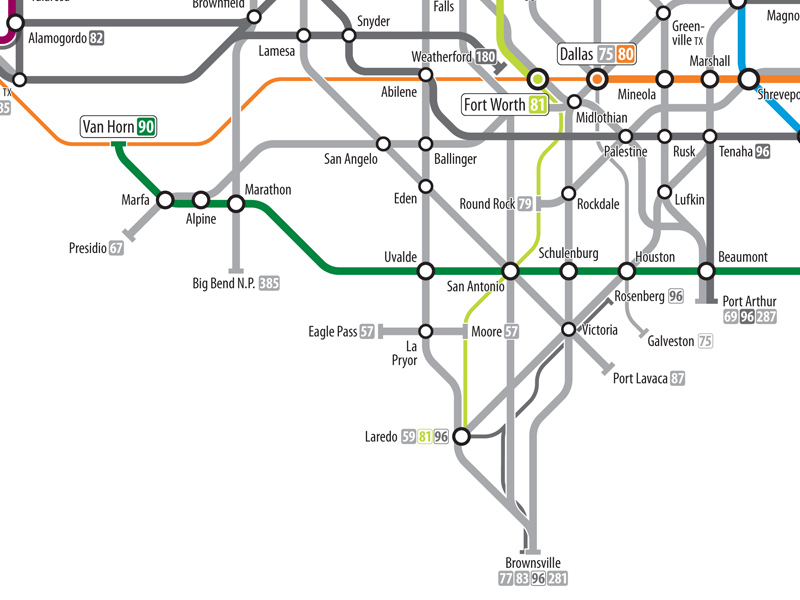
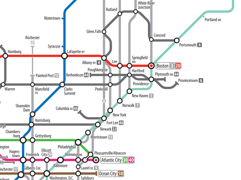
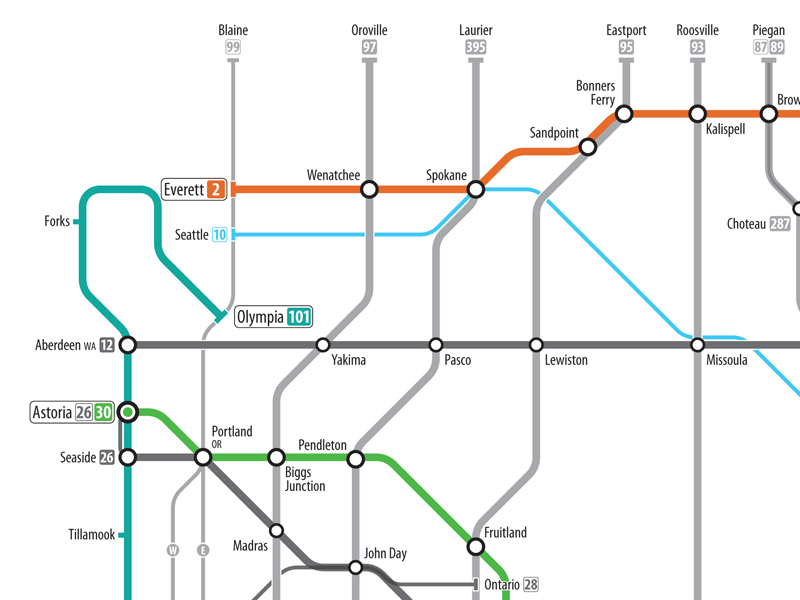
As any student of bus or subway maps can tell you, the two-dimensional representation of a transit system is usually far from accurate. Bus routes and tunnels are made with geographical and geological issues in mind and would just be confusing if laid bare. With that in mind, designer Cameron Booth took a similarly minimalist approach to mapping the U.S. highway system. Styled after subway maps, the result is an eye-opening look at the country, and how people get around it.
Recommended Videos
Click here for a larger version of the image.
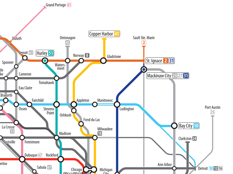
I’m a Michigan native and I didn’t even recognize Booth’s interpretation of the Great Lakes state.
(Cameron Booth via io9)
- A map of Skyrim
- Google Maps walks into Mordor
- Street view of post-tsunami Japan
- Google Earth, on 48 screens
The Mary Sue is supported by our audience. When you purchase through links on our site, we may earn a small affiliate commission. Learn more about our Affiliate Policy




Published: Dec 20, 2011 05:18 pm