Guess What? Apple’s Maps Aren’t “The Most Powerful” Anymore

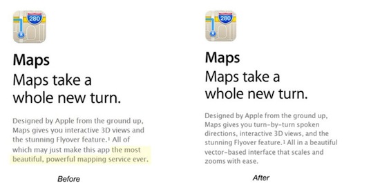
Hot off the heels of Apple CEO Tim Cook’s sheepish apology to consumers over their lackluster new Maps app, Apple has retracted one of its boldest statements about the highly-criticized service. Until yesterday, Apple’s description of Maps on their website called it “the most beautiful, powerful mapping service ever.” That sentence, which would now seem especially foolish in light of Mr. Cook’s statement, has since been retracted and replaced.
Before you go crazy, saying things like; “WHO THE HELL THINKS APPLE MAPS IS BETTER THAN GOOGLE’S!?”, keep in mind that we’re talking about Apple’s description of itself. Apple’s website will, or at least should, always be the most unilaterally positive force behind all of the company’s products. That’s why the change isn’t surprising, but also why it’s is so substantial: It solidifies the notion that Apple maps not only constitutes the company’s greatest misstep in years, but also it’s first retreat in recent memory. Where many tech companies like Nokia, Sony, and Nintendo have been forced to come to publicly admit defeat over the years, Apple has long remained above reproach.
Apple’s new language may not be as flashy but, as you might expect, remains supportive of the service. The new description now calls Maps; “…a beautiful vector-based interface that scales and zooms with ease.” I’ve heard plenty of complaints about Maps, but none of them have criticized its ability to zoom in.
(iDaily.De via 9to5Mac, Image Credit; iDaily.De)
- More on Tim Cook’s Apology
- Meanwhile, Google isn’t working on a new “Maps” app for iOS
- I don’t think jailbreaking the iPhone 5 is going to help, but it’s still worth a try.
Have a tip we should know? [email protected]
