Granted, I’m basing my assessment off of Days of Future Past‘s previous Hardees ads, which managed to be outrageously sexist and the stupidest thing in the world, respectively. The marketing tie-in bar for this movie is not that high. When I saw the words “Days of Future Past” and “AXE commercial” I expected the video to make me bleed out of my ears, but instead it only caused some heavy-duty wincing due to second-hand embarrassment. Good… job?
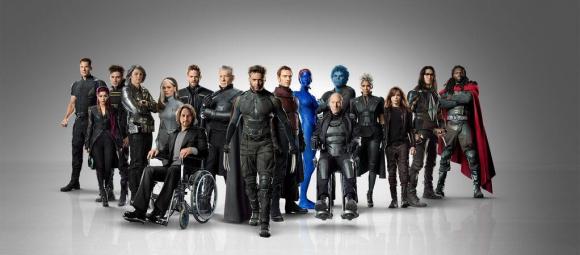
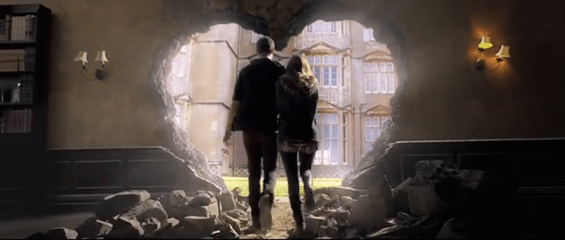
Behind the cut you’ll find two Days of Future Past clips, one of which is the The Amazing Spider-Man 2 post-credits stinger that made people think, for a brief, shining moment, that Sony and Fox might share their toys. Because I don’t want you to get too comfortable, there’s yet another awfully Photoshopped Days of Future Past poster, too.

Click for full-size. I wouldn’t mind Days of Future Past putting out some bad posters—there have been, literally, several dozen total, after all—if the majority of them looked like they weren’t slapped together by first-year design students fulfilling their internship quota at the 20th Century Fox marketing department. Could you try to make it look like they might conceivably be in the same room? Please?
(via: Collider, SuperHeroHype, CBR, CBR)
- Seriously, what the hell is with their posters?
- Someone should be fired.
- The trailer people can stay, though.
Are you following The Mary Sue on Twitter, Facebook, Tumblr, Pinterest, & Google +?


Published: May 7, 2014 09:30 am