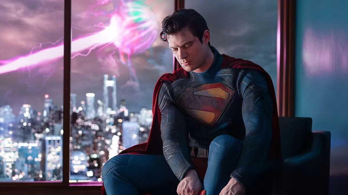
Hey, remember those clever image combinations that particularly festidious Facebook users put in place during the last major overhaul to the social networking site? Well, because of Timeline, all of those are going to be completely messed up. Thankfully, the new enormous “cover” image at the top of the redesigned user pages has ample opportunities for image shenanigans. If you’re keen to try something like you see above, check out the instructions after the break.
Before you start, it’s important to note that the “cover” image is 851 x 314 pixels, and the inset avatar image is 180 x 180, reduced to 125 x 125 pixels. According to Nico, here’s how you can give your new Timeline a splash of something special.
After the download unzip the file and open fb_timeline_template.psd
In the layers folder “personalization” do your personalisation
Then hide the layer “overlay” and create two separate pictures (use the guides or the layers “avatar” and “header” for the sizes of the pictures)
Upload them and choose it as avatar and title picture.
That’s it! You’ll be impressing all your Facebook friends in no time.
(via Dudecraft)
Timeline is rolling out for all Facebook users


Published: Feb 6, 2012 02:33 pm