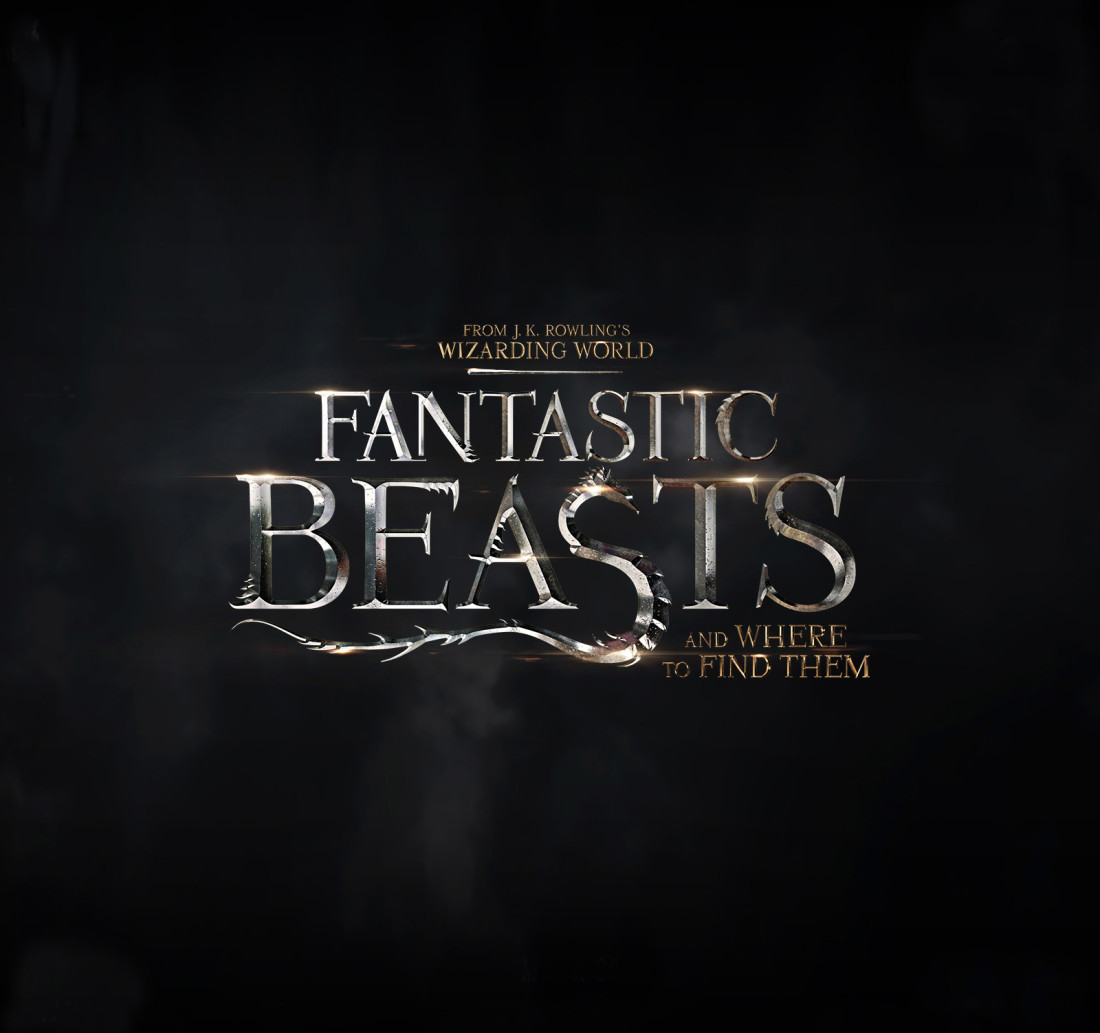
We have a Fantastic Beasts and Where to Find Them logo! But what does it mean? Thankfully, a Pottermore correspondent spoke to the design team about the artwork and the secrets behind the logo.
The team was very careful to avoid spoilers but did share some info about how it was inspired by the Harry Potter title:
If you think of Harry Potter, that logo instantly comes into your mind: the lightning bolt ‘P’ and the shape of the words. So we wanted this one to feel like it was born of that same world. We were trying to come up with something that drafted similarly off that iconography but in a new way. In a Fantastic Beasts way.
The logo is a blend of beasts, it’s not just one takeaway. When we arrived on idea for the ’S’ it excited us. So we thought there must be a way to accent these other letters with claws or ribs — hints to other beasts, while this one is the logo’s centrepiece.
When asked how they approached the Fantastic Beasts’ Jazz Age backdrop in the design, the team replied vaguely:
If you think of New York in the 1920s you have Deco architecture, the subway systems and this kind of a burgeoning metropolis. The Roaring Twenties has a visual identity that you can borrow from, and what would that world look like through the lens of the J.K. Rowling’s mind? You want the logo to feel iconic and timeless. So while Deco and the 1920s setting are things to think about, we don’t know exactly where the story is going to take us.
What kind of new beasts do you think we’ll see next year? I feel like I’m staring at one of those 3D images you have to cross your eyes to see because all I can find is a serpent/dragon/basilisk and disjointed teeth and claws.
(via Pottermore)
—Please make note of The Mary Sue’s general comment policy.—
Do you follow The Mary Sue on Twitter, Facebook, Tumblr, Pinterest, & Google +?



Published: Nov 3, 2015 04:45 pm