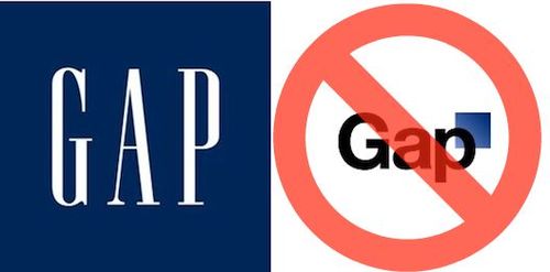
Gap Kills New Logo: Back to the Original “Blue Box”
A week after Gap‘s new logo consisting of Helvetica plus a square was met with nigh-universal derision online, the company has announced that they’re officially scrapping the idea — as well as the halfheartedly-proposed logo crowdsourcing initiative — and will be returning to their “iconic blue box.”
“Since we rolled out an updated version of our logo last week on our website, we’ve seen an outpouring of comments from customers and the online community in support of the iconic blue box logo.
“Last week, we moved to address the feedback and began exploring how we could tap into all of the passion. Ultimately, we’ve learned just how much energy there is around our brand. All roads were leading us back to the blue box, so we’ve made the decision not to use the new logo on gap.com any further.
“At Gap brand, our customers have always come first. We’ve been listening to and watching all of the comments this past week. We heard them say over and over again they are passionate about our blue box logo, and they want it back. So we’ve made the decision to do just that – we will bring it back across all channels.
“In the meantime, the website will go back to our iconic blue box logo and, for Holiday, we’ll turn our blue box red for our seasonal campaign.
“We’ve learned a lot in this process. And we are clear that we did not go about this in the right way. We recognize that we missed the opportunity to engage with the online community. This wasn’t the right project at the right time for crowd sourcing.
“There may be a time to evolve our logo, but if and when that time comes, we’ll handle it in a different way. “
Fast Company Design asks a good question which wasn’t asked enough as the Gap logo-jeering built up to fever pitch: “Are re-brandings — whether bold and visionary or downright terrible — impossible in the age of Twitter and Facebook? Will companies know when an outcry isn’t pointing to a terrible design, but rather just people refusing to embrace change?” The Gap logo backlash was almost instantaneous and spawned parody sites, fake Twitter accounts, etc: However, the kinds of people and agencies who make parody sites and fake Twitter accounts may not be all that representative of the rank-and-file of Gap customers.
Imagine Gap rolling out its new logo in an Internet-free (or at least social media-free) world: Designers would have groaned and Wallpaper* and New York Magazine might have dropped withering items about it in their back pages, but would la Résistance have ever gotten sufficiently organized or popularized that the bulk of consumers knew enough to know that Helvetica plus square equaled a ‘bad’ logo? Regardless, online, the teachings of the vanguard are infectious and the bon mots that the cool kids on Twitter share with each other have an audience of millions, and so back to the blue box Gap logo we go.
(via Fast Company Design. title pic via TDW)
Have a tip we should know? [email protected]
