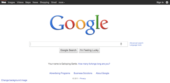
How to Remove the New Black Bar on Google.com

Many people noticed the new black bar sitting atop Google.com like it owned the place yesterday, and since then, most of those people have sought out ways to remove said black bar and revert their Google to the less eye-popping, minimalist version they knew and loved. After searching through the settings tab like a madman, I could not turn up some kind of simple disable feature, so I took to the Internet to find a quick, easy way to remove that obtrusive bar and get my eyes to focus on the search box once again.
At the time of this post, I’ve found two different ways to remove the bar, both of which are easy enough, but admittedly, not as ideal as a simple, native option in the bar itself. Head on past the break to pick your poison and remove some unnecessary Google screen pollution.
1. Greasemonkey Script
First off, Greasemonkey isn’t compatible with all browsers, such as Internet Explorer, Safari and Opera, so if you don’t use a compatible browser, you’ll have to use a workaround, detailed here. Currently the script just hides the black bar completely, which means it hides the links contained within the bar, but the creator, Keith Dsouza, is currently working on replacing the eye-popping black with a less obtrusive color, basically reverting Google to the earlier version we’re all used to. You can download and install the black bar hider script from here, and make sure to stay on top of Dsouza’s progress if you really care about the links the script removes and can’t wait for his modified script that brings them back.
2. Stylish
The other easy way to remove the black bar is to employ the help of a user-created style. If you use Chrome, you can install Stylish from the Chrome Web Store. If you use Firefox, you can install Stylish from here. If you use another browser, it seems you’re out of luck. After Stylish is installed, simply navigate here and follow the quick instructions on installing the style (which boils down to clicking a link), which will revert the black bar to the previous light-colored theme. Unlike the current version of the above Greasemonkey script, this style will keep the links from the black bar, rather than remove them entirely along with the bar.
Hopefully one of the above two methods will placate your browsing eyes until Google either reverts to the old easier-on-the-eyes bar, or adds a native option to pick a preferred color. Happy browsing.
(via Techie Buzz, reddit, Stylish)
Have a tip we should know? [email protected]
