Indigo’s Special Edition Covers For ‘Six of Crows,’ More Have Readers Baffled

Of the hundreds of books I come across daily online and in person, there are a bunch with awful-looking covers. However, most stay in the group chat—unless the design perpetuates harm to a marginalized group (including most working artists), or it is particularly controversial. The major exception is when bestselling, recognizable titles don’t stick the landing, like these puzzling, major redesigns of the Twilight series, which debuted nearly two years ago. Now, it’s a number of popular books re-released by bookseller Indigo. These titles are not unified by anything but color (strangely) and that they’re popular.

Flatiron Books)
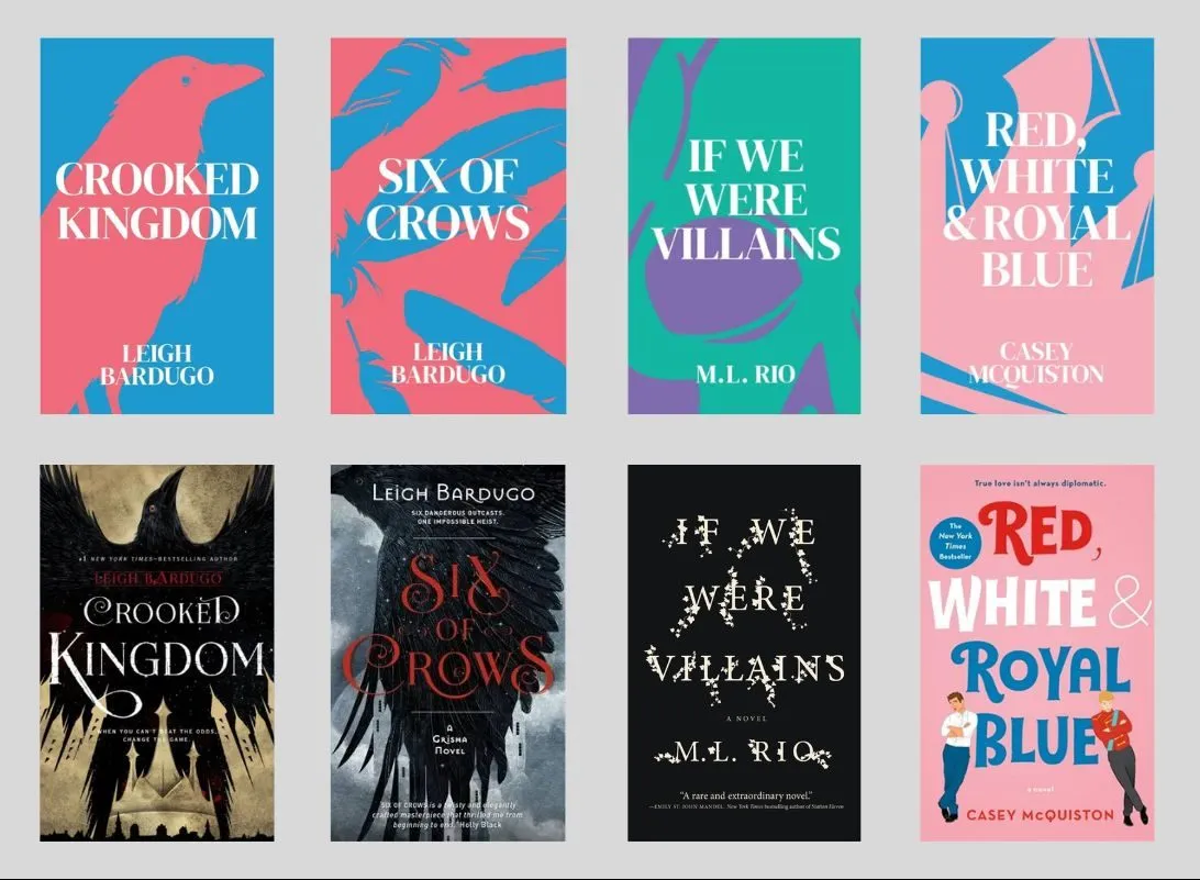
TikTok user Jordan Murray first spotted these Indigo-exclusive covers on June 20. If this seems like a really random assortment of books, you’re right. Two books make up the Six of Crows Duology by Leigh Bardugo, the only Grishaverse novel with Indigo-exclusive cover designs. (To be fair, these two seem like the fan-favorite books.) Then, there’s a random dark academia novel (If We Were Villains by M.L. Rio) and a contemporary romance novel (Red, White, and Royal Blue by Casey McQuiston).
All except Rio’s book feature this vibrant blue and Pepto pink, but her thriller employs a palette reminiscent of the ’90s SOLO cup with turquoise and purple. The only cover design that seems thematically or tonally consistent with its story is Casey McQuiston’s novel. I’m not saying it’s a great cover, but one can follow the design choice beyond the iconography. Slated for a July 18 release, these designs actually reached store shelves a few weeks early. This dispels any doubt that these covers were just mock-ups or placeholders. Indigo considers them finished designs.
Minimalism is probably not to blame
Since the COVID-19 pandemic began in 2020, there’s been a trend against minimalism and millennial gray for various reasons. However, publishing hasn’t quite gotten the memo. Until now, that hasn’t been a problem because that gives great variety in book covers. More doesn’t always mean better, and a simple design can effectively communicate an idea or feeling. This isn’t really one of those cases, though.
Based on the response online and what I know of these titles, most fans of these books feel alienated by the new covers. A handful of people are trying to spin the Bardugo titles as a positive for featuring the transgender flag colors. However, the book doesn’t feature any major trans characters so their headcanon is doing some heavy lifting. Additionally, new readers might be misled by the color-coding. You can keep that “don’t judge a book” line to yourself, because book covers are designed to be judged and to reflect the inside of the novel.
Another baffling element of this whole rollout is that Indigo has produced stunning special editions many times before. Just last year, the Canada-based bookstore chain also prioritized neat, simplistic geometric covers. Here, Indigo rereleased 28 special anniversary edition books for the 25th anniversary of the store. Not only do the covers reflect the tone and themes of the book, but working with the Montreal and LA-based Wedge studio, Indigo enlisted 25 Canadian artists to design each of the 25 covers. For example, Métis artist Jean Paul Langlois created art for The Inconvenient Indian by Thomas King and The Kite Runner by Khaled Hosseini. The idea was to celebrate (and sell) books while introducing readers to both established and up-and-coming artists.
(via Jess Owens on YouTube, featured image: Alyssa Shotwell)
Have a tip we should know? [email protected]
