We’ve posted plenty of infographics in our day, and this has to be one of the coolest sets we’ve seen: Columbian photographer Jose Duarte has used real-world materials to construct a series of infographics representing the state of the Internet. These are a lot more memorable than the bevy of overly graphic-designed infographic SEO plays by insurance companies and online schools, no? Hopefully this proof of concept leads to more compelling data visualization across the Web.
Recommended Videos
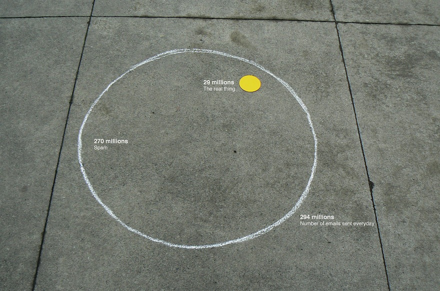
1. Emails sent every day — Spam versus genuine messages:
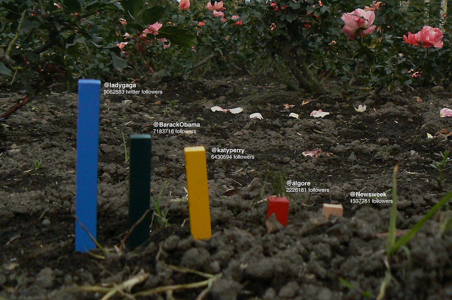
2. Comparing Twitter followings circa 2010:
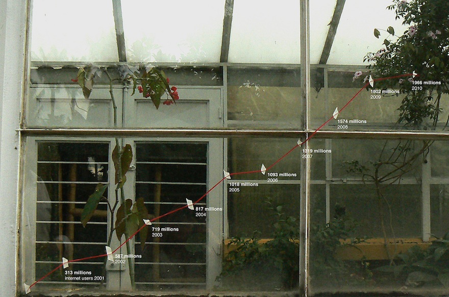
3. Internet users worldwide, 2000-2010:
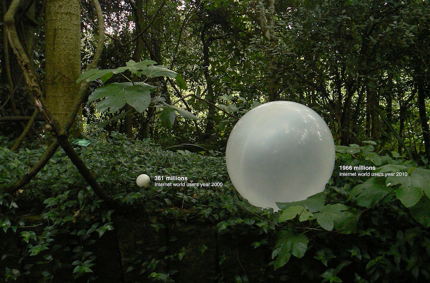
4. 2000 and 2010 Internet compared:
5. Internet users by country:
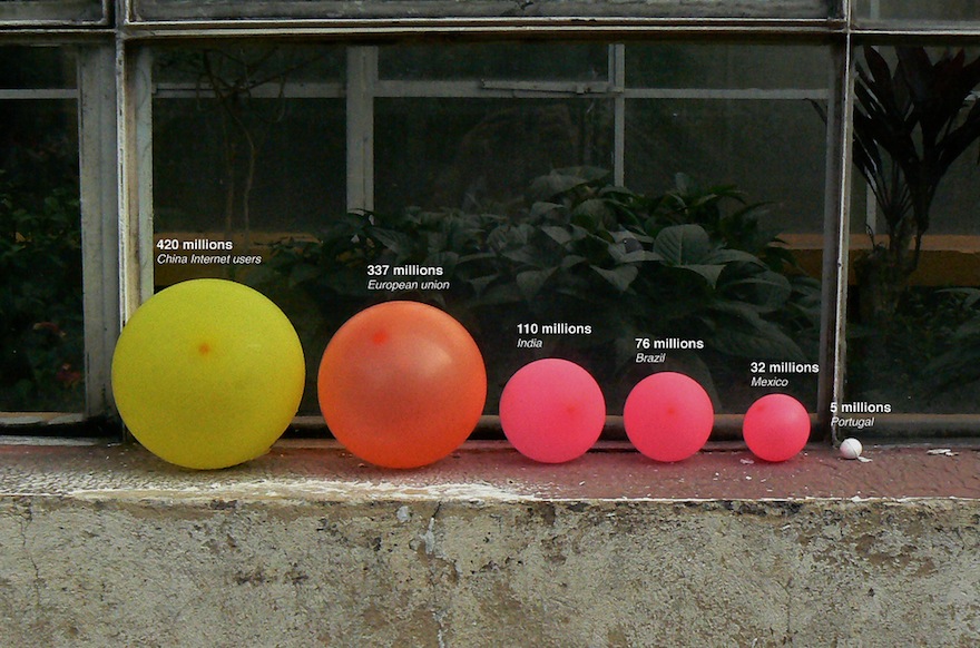
(Jose Duarte via Cindy Au)
The Mary Sue is supported by our audience. When you purchase through links on our site, we may earn a small affiliate commission. Learn more about our Affiliate Policy


Published: Apr 22, 2011 5:07 PM UTC