Recommended Videos
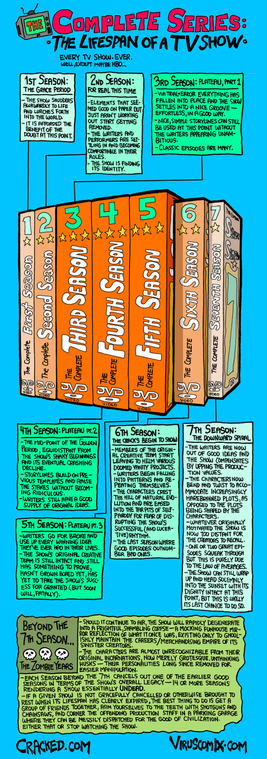
Winston Rowntree has created an infographic illustrating the arc of watchability that is followed by most long running television dramas, and it simply contains too much truth not to post. From The Grace Period, to the three season long Plateau, through to the Zombie Years; fans of LOST and The X-Files should particularly relate.
Personally, I don’t have too many television shows that I’ve stuck with that wound up following this chart exactly. Most of my beloved shows intentionally lasted only 3-4 seasons, or were canceled before their prime. And I didn’t start watching the X-Files until it had already jumped the shark.
But… there was The West Wing.

Rowntree is also the creator of this Subnormality, a webcomic.
The Mary Sue is supported by our audience. When you purchase through links on our site, we may earn a small affiliate commission. Learn more about our Affiliate Policy


Published: Aug 13, 2010 04:34 pm