This video essay from Patrick (H) Willems explores the aesthetic within Marvel movies, which, over the years, has become something of a muddled mess.
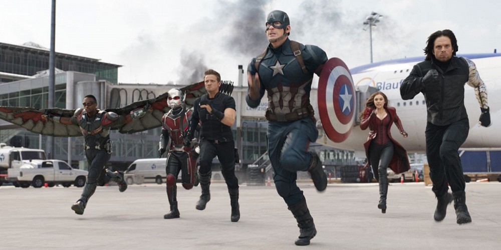
As you can see, many scenes that are supposed to otherwise be thrilling are instead turned into “a giant parking lot.” I’ll say, I felt exactly the same way about the airport fight scene in Captain America: Civil War. Having read the original comics, I knew that the “original scene” it was supposed to be based on was massive, packed to the rafters full of heroes both famous and obscure. Given the fact that we haven’t exactly been introduced to that many heroes in the Marvel Cinematic Universe (because really, who has the time), it’s understandable that the entire scene looks like… well, looks like a schoolyard fight.
Something that might have helped alleviate that sense of boringness and ratchet up the spectacle (which it was undoubtedly going for) was if they had used proper color grading. As Willem explains in much greater detail within the video, many of the issues with Marvel’s aesthetics have to do with the fact that they don’t have any “true black” colors. In the absence of any “truly black” coloration, the rest of the colors fail to pop. Willem also does an excellent job of tying this issue back to comics and how a similar practice was used for X-treme X-men. Marvel eventually discontinued the style and practice because, lo and behold, it made the images washed out; it didn’t look good.
The video is well worth watching, and it’s an intriguing look into how films are made. If you’re a big fan of good cinematography and really want to dig into why certain movies look the way they do, then this video’s for you.
(via Sploid)
Want more stories like this? Become a subscriber and support the site!
—The Mary Sue has a strict comment policy that forbids, but is not limited to, personal insults toward anyone, hate speech, and trolling.—
Follow The Mary Sue on Twitter, Facebook, Tumblr, Pinterest, & Google+.


Published: Nov 24, 2016 03:00 pm