The Best Horror Movie Posters of All Time
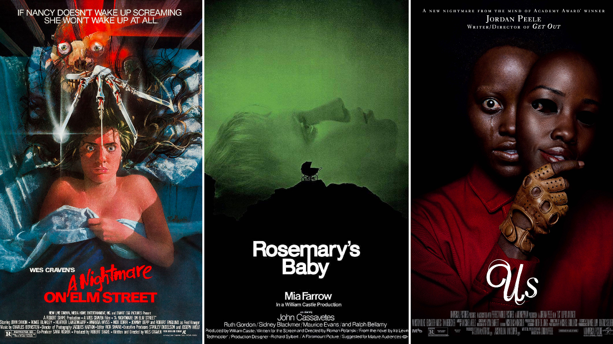
A movie poster is more convenient than a trailer. Why would I take two minutes out of my day to watch a trailer when I could take two seconds to look at a poster? I just LOVE giving things a cursory glance. In this modern world, it’s the only sort of glance I’m capable of giving! In a time when movies are either made gloriously or better not made at all, a poster can be everything. And these horror movie posters are EVERYTHING.
The Exorcist
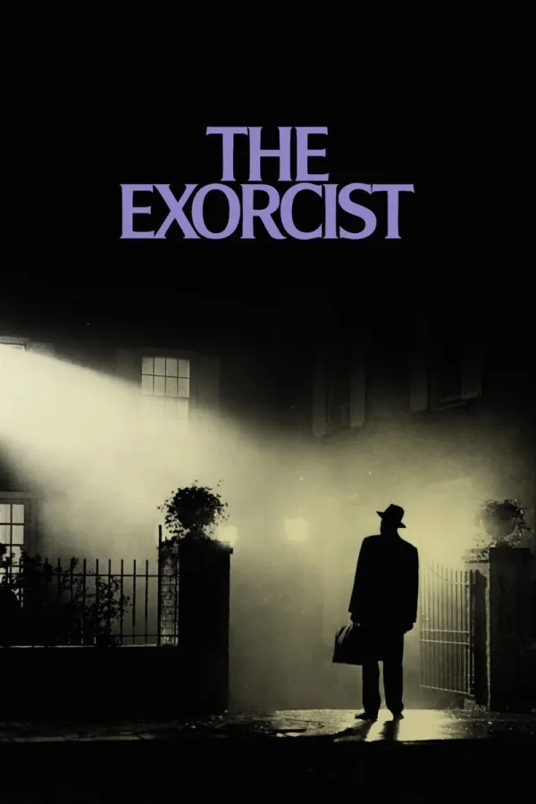
Gaze upon the pictorial glory of the poster for The Exorcist! This picture is worth a thousand words, yes. And all of those words say “RUN AWAY.” A man stands on a darkened street, bathed in the lurid glow of a particularly stress-inducing light! But the true terror of this poster is that the light is not coming from the streetlight, no no. It’s coming from the window of a house! But no bedroom light could be that strong! That direct! It’s almost as if something is focusing on the man in the street. Eyeing him. Daring him to come inside. While the light looks angelic, we must remember that even the darkest demons were once bright angels too. And the man in the street is about to meet one face to face.
Jaws
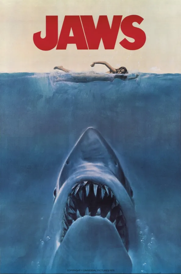
The poster for Jaws follows the old adage: sex sells. Especially when hotties are in mortal peril. Horror has long paired sex and violence together, like some kind of f*cked-up Reese’s Cup. Terror and arousal are virtually indistinguishable from each other in the body. Shaky hands. Shortness of breath. Elevated heart rate. It’s only our minds that help us qualify whether or not these feelings are sexy or scary (or both). Terror is so ghoulishly complementary to intimacy because, after all, there is nothing more frightful than being attacked while at our most vulnerable. This naked women swimming in the open ocean above the waiting Jaws of a shark? Doesn’t get much more vulnerable than that.
The Evil Dead
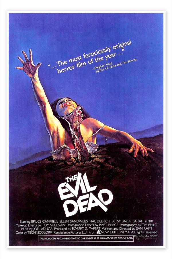
I’m pretty sure we’ve all had the nightmare that The Evil Dead dramatizes in this poster. It’s got ALL the fears: fear of violence, fear of being buried alive, and of course fear of all things that are (un)dead. In another pairing of the erotic and the depraved, this half-buried woman grasps helplessly to the sky while a spooky dead hand wraps around her neck to drag her under the ground. Shudder.
Rosemary’s Baby
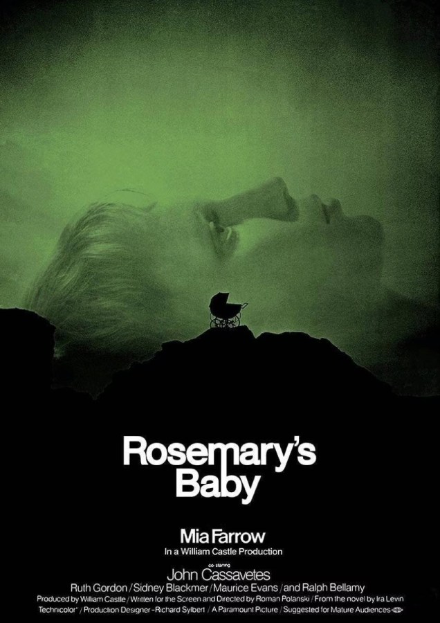
What in the Neon Genesis Evangelion is this?! Giant heads laying on the ground, staring sightlessly toward the bleak sky? I’m starting to see where the creators of said seminal anime got their idea from. The color scheme of the poster for Rosemary’s Baby is enough to make one’s stomach turn. Look at that eerie, smoky, unsexy green! And centered in the frame, in menacing silhouette, is a stroller that serves as a reminder of the most horrible sort of monsters that exist in the world: children.
The Thing
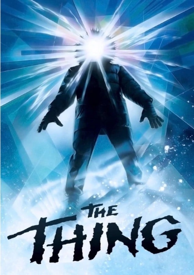
The thing is, this poster for The Thing makes me seriously uncomfortable. To all those who say that Lovecraftian horror has never been successfully captured on screen, I say that The Thing is the exception. The poster alone has all the H.P. Lovecraft trimmings! Set in a frozen waste like At the Mountains of Madness, glowing with eerie light like The Color Out of Space, and picturing a not-quite-human form like The Thing on the Doorstep, this poster just SCREAMS that its creator—the legendary Drew Struzan—must have been reading Lovecraft’s collected works at the same time.
A Nightmare on Elm Street
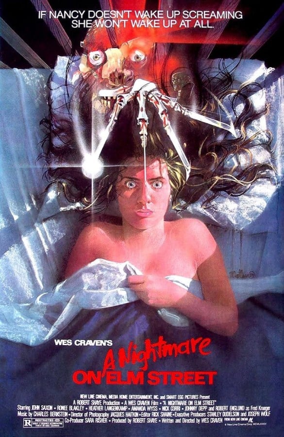
What really gives me the ick about the poster for A Nightmare on Elm Street is the positioning of Freddy Krueger’s gross finger blades. Particularly the one that is directly above the terrified teenage girl’s forehead. Like he plans to give her a lobotomy. Totally gross. While it’s a great poster, I don’t think I could ever put it up on my wall.
The Descent
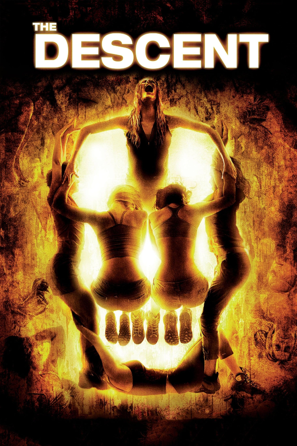
You know how high school cheerleaders make those human pyramids? The gals from The Descent did those high schoolers one better by making a human skull! A human human skull! It even has feet teeth! How fiendishly creative! What makes this poster even more unsettling is the writhing mass of creatures in the corners of the frame.
The Cabin in the Woods

Not gonna lie: I’d be pissed if somebody made a Rubik’s cube of my house. However, the poster for The Cabin in the Woods uses the effect to great … well, effect. The combination of creepy cottage core and mathematical shapes gives the poster a classic rural horror meets sci-fi spin. Literally. ‘Cause it’s spinning.
The Legend of Boggy Creek
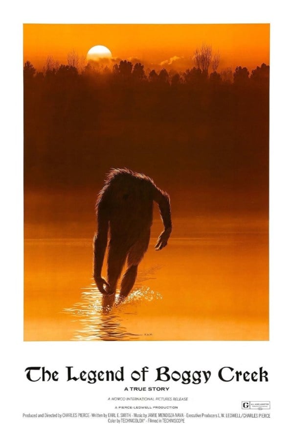
The Legend of Boggy Creek is not a good movie, but the poster is my favorite on this list, hands down. Just look at that iconic design! The sunset woods and river give the poster a romantic and ethereal quality, while the limping shape of the monster adds intrigue and suspense. Somebody needs to take this poster, divorce it from this movie entirely, and use it for the cover of John Gardner’s philosophical monster novel Grendel.
Us
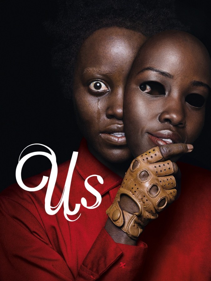
While most movie posters attempt to communicate pain in the physical sense, the poster for Us is an emotional slap in the face. Peeling off a mask of serenity to reveal a not-so-peaceful interior is the definition of horror. Oh, that cabin in the woods looks totally peaceful, there couldn’t POSSIBLY be a hook-handed slasher in the trees! WRONG. Yet this poster prepares us for the emotional consequences of taking things at *ahem* face value.
(featured image: New Line Cinema / Paramount Pictures / Universal Pictures)
Have a tip we should know? [email protected]
