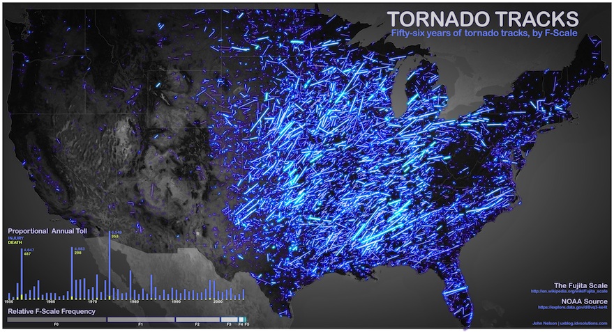
If All the Tornadoes From the Past 56 Years Left Neon Blue Tracks Across the US, It Would Look Like This [Infographic]
Armed with 56 years of information on tornadoes and a computer, John Nelson has created this remarkable map of the United States. On it, he’s charted all of the known tornadoes and color-coded them by intensity. The result is a beautiful, if terrifying, map of destruction. See it, after the break.
Nelson says that he pulled the data for the image from data.gov, where he was able to pull down nearly six decades of NOAA information on tornadoes. He then assigned each category of storm a color, with F0 storms a dark purple and neon blue used to represent the most powerful category — F5 storms. Though it’s far from scientific, it’s still a startling look these enormous storms.
Still not big enough? See the full-size image here.
(IDV User Experience via BuzzFeed)
- Look at these bonkers clouds
- Scientists capture image of 12-mile tall dust devil on Mars
- The sun has tornadoes, too
- Massive tornado “debris ball” spotted on radar
Have a tip we should know? [email protected]
