Update: This article was published prior to the resurfacing of clips where David Choe shared a story regarding sexual assault. He has since claimed the story was fabricated, but the nature of it all is such that we felt compelled to add this update and clarify that we do not condone anything about this situation. This article was strictly meant to explain the art and its relation to the story.
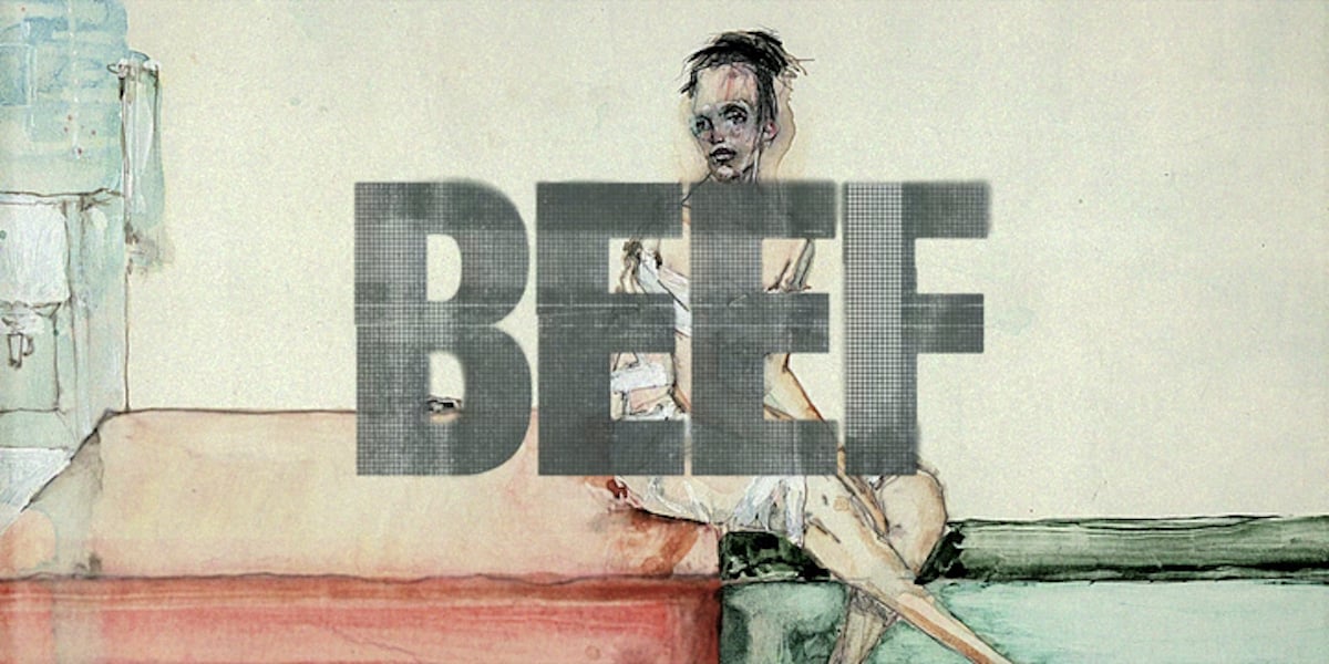
There are a lot of interesting things to talk about with the new show Beef, but one aspect that might go overlooked is the title art. At the beginning of every episode, for just a few fleeting moments, we’re shown a piece of art that’s very Francisco Goya-esque in design, often abstractly grotesque, with the episode’s title overlaid upon it.
For reference, Goya is considered to be one of the greatest Spanish painters in history, yet he’s known by many for his “Black Paintings.” These paintings were done during his life’s decline, showcasing disturbing imagery that some people cannot even stomach to look at. Perhaps the most famous is “Saturn Devouring His Son”: a recreation of the Saturn myth, where Saturn is shown to be a massive, sickly looking, scary creature, with his eyes sticking out of his head, and his son’s eviscerated body being stretched between his mouth and hands.
While it hasn’t been strictly confirmed that Goya influenced the paintings in Beef, I thought I’d mention them anyway (and “Saturn” in particular), because those paintings elicit the same feelings as Goya’s. They showcase bodies painted in agonizing positions, with colors that make you flinch from how sickly they look on human flesh. There is a distinct sense of pain in each image, physical or emotional, and this ultimately ties in beautifully with the show’s overall themes of trauma and catharsis.
The only reason things escalate in this show is because the main characters are deeply pained, dark people, and they don’t have anyone to help them out of that pain. Therefore, when given a choice to either fix their own behavior, hard as that may be, or continue to lash out and pass their pain onto others, they almost always choose the latter. It’s ugly, it’s uncomfortable to watch, and it’s something that is difficult to explain to someone who doesn’t “get” it.
Hence why art is so powerful. Anyone can walk into a room of Goya’s paintings and feel disgusted. In this particular case, the artist behind most of Beef‘s paintings, David Choe (who also plays Cousin Isaac), had already created these paintings prior to the show even beginning production. As he was friends with showrunner Lee Sung Jin, he allowed the team to choose from any of his paintings, and I find it incredibly telling that they chose this particular set of paintings.
They wanted the audience to know, even if they didn’t already get it, that this wasn’t a “haha funny” comedy. It was gonna get dark, mean, and grisly. It was gonna go deep into the psyches of deeply hurt people. By nature, the art had to reflect that, and considering Choe was already known for his self-described “dirty style” of art, his work proved to be an apt choice.
As a woman who’s had to swallow a lot of pain and be told to shut up about it throughout most of my life, I felt immense satisfaction upon seeing those paintings at the beginning of every episode. In a way, they validated the catharsis I felt watching the show. If art is meant to elicit feelings within us, I also think it’s true that one’s choice of art says a lot about the show’s message. Sure, it might be dark to some, but for the rest of us, it’s an acknowledgment of reality—beautiful and grisly as it is.
(Featured Image: Netflix/A24)


Published: Apr 11, 2023 02:25 pm