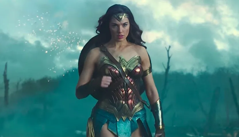
If you’ve seen Wonder Woman, you’ll know that the movie is full of color. From the first scenes in Themyscira, which is a lush and vivd utopia, Patty Jenkins’ film announced itself as a brighter film far from the colorless and heavy tones of Batman v Superman, the movie where we last saw our hero.
Impressive contrasts between the coloring of Themyscira, London, and the war front were all used in ways to serve the narrative. Much of this credit lies with cinematographer Matthew Jensen, who spoke with Vulture about the use of color in the film and Jenkins’ departure from the desaturated, grim look that’s dominated not only DCEU films, but lots of recent blockbusters. Cracked traced this phenomenon not long ago, identifying Spielberg’s Saving Private Ryan as the start of the trend, as the director wanted to reproduce the feel of an old WWII reel. Now, in an effort to communicate severity or seriousness, films often turn to an unrealistic absence of color that’s more often than also sucks out any joy or fun from a film.
Jensen says that Jenkins embrace the freedom she had to make this Wonder Woman film separate and distinct from other DCEU films, fortunately with little studio interference. Thank Hera, because we know that the studio almost didn’t let the best battle scene through either. According to Jensen, they referenced everything from colored clouds in a James Blunt photo, to Edwardian painter John Singer Sargent, and recent Wonder Woman artists like George Pérez and Cliff Chiang. I haven’t had the chance to check it out yet, but I’ve heard that Wonder Woman: The Art and Making of the Film is an amazing book that dives into details like this one.
For recreating the historical setting, Jensen says “[Jenkins] was really concerned, because it was a period movie, that she didn’t want it to look like what we associate with period movies, which is a lot of desaturated colors and a soft, gauzy romanticization of the past.” Rather, he explains, “The period would come from production design and costumes and setting, but we wouldn’t be doing anything with the lensing that would say that it’s a period movie, essentially.”
If you loved the look of Wonder Woman as much as I did, check out the full interview over at Vulture.
(via Vulture, Image: Warner Bros.)
Want more stories like this? Become a subscriber and support the site!
—The Mary Sue has a strict comment policy that forbids, but is not limited to, personal insults toward anyone, hate speech, and trolling.—


Published: Jun 6, 2017 04:11 pm